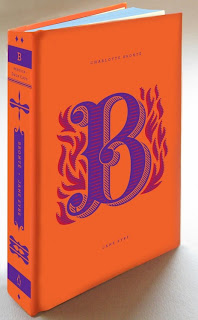
For our freshers 'Bible'/ guide to being a student in Leeds, we wanted a design that would appeal to our audience of aspirational graphic designers, so we figured our Bible had to look nice and express good visual qualities in it's typography.
Examples of what we're trying to achieve:
These are a couple of examples of the kind of publication we want to put together. But we want our tone of voice on the front cover to be almost comically sacred, as if our book will be the only one the student will ever need, as opposed to being advisory but almost a set of rules to live by. The inside may be different to this, but we want the outside to convey this message.
------------
We wanted really nice typography to showcase our advice. A good example of the kind of work we want to produce would be in the style of artist Jessica Hische, because of her vintage-yet-modern style.
Visual Research - inspiration for typographic and front cover designs:
------------
For the inside of our book, we want to feature a large (possibly even as big as A1) of Leeds showcasing all of the places we have mentioned in the book. We wanted it to be customised and simplified perhaps with imagery, like some of the designs below.
Inspirations for the Bible front cover design:
Helped me to create banners - really love the utilisation of the old design into new work, I think it works really well.
Loved the illuminated illusion and inspired us to look for gold foiling techniques.
This particularly inspired the '2013' design that was used on the cover
Inspired the feel for a lot of the title pages
Inspired the 'G' for the Graphic design title page.
Inspired the shape featured on the front and back covers
D & AD's 'The Book' is what gave us the initial idea of creating something that looks almost sacred/ biblical on the outside and completely modern on the inside.
Particularly inspired the beams of light on the front cover and back cover design
Survey results which helped us throughout making the book:


