First things first Seminar
Today, in our last seminar of the year (!) we raised a discussion about the different viewpoints and opinions that sprung from the 'First things first' manifesto of 1964 and the revised version of 2000. We were split into 4 groups and then made notes on each of the 4 pieces of texts relating to these matters:
First Things First 1964:
With a little background research into the initial author of First Things First; Ken Garland, we can put into context his reasonings. In the decade this was written, the western world saw a boom of consumerism. The country finally saw a true recovery from the world wars and the country was back on it's feet, with some disposable income to spend. Without having objects around them for so long, it was inevitable that there would be a surge in materialism. This meant that lots of designers saw a change in their job role from essential political artist to advertiser, flogging mundane objects to the general public for a living. Meanwhile, there was another war stirring up the publics concern: Vietnam. This could be argued the start of revolutionary hippie culture against the war, which Garland was a part of; for example the very first Easter March. He argues that designers are getting bogged down with the more trivial design tasks while they could be involved and prioritise their efforts in more meaningful, functional design.
First Things First 2000:
The revised First Things First manifesto was a much angrier and urgent relative to its proceeder. This was because of the overwhelming force of consumerism rapidly increasing since the first manifesto in the 60's. Rather than a polite request, this manifesto is a wake up call to designers, asking them to challenge consumerist culture and create 'more useful, lasting and democratic forms of communication' to stop exploiting their creative talent. As opposed to the mundane consumerist objects listed in the First Things First 1964 manifesto, the 2000 one lists things such as credit cards, diamonds and designer coffee, much more self-indulgent and contracting products. This manifesto is also addressed to all creatives and not just graphic designers like the original manifesto.
First Things First (Revisited) article from Emigre magazine by Rick Poynor:
Rick Poynor addresses some of the issues and observes the different attitudes towards both First things First manifestos. He states that even those designers who lay low and turn away from their political responsibilities and argue that they are just making a living creating adverts and don't want to change the world are still contributing to the political state of affairs by feeding the consumerist culture whether they like it or not because design has power. He also goes on to say that the manifestos aren't just design related, they are a political project; the environment we live in was designed!
The Footnotes of First things First by Michael Bierut from 2007:
In these footnotes on the 2000 manifesto, Michael Bierut argues against and defends his way of living. He lightly points out that the creatives who signed the manifesto were already well established as designers and didn't NEED to be involved in the mundane tasks of advertising for consumerist culture and that the position they were in was probably because they had to go through all of those kind of tasks to be in a position to refuse them or that they've always had the pleasure of designing for the 'culturally elite'. He also questions the manifesto's request for motives: Can you just drop out of the consumerism game? And if you can, should you? What good will come out of it? He also questions that the world is complicated and nothing is as simple as just becoming a designer for a pure cause, and uses the Brooklyn Academy of Music, a nonprofit organisation charity funded by a consumerism tobacco giant company as example. Does the fact that it's funded by a 'negative' organisation make the Academy evil itself? He concludes with the argument that is it really a good cause? Is switching from mass manipulation for commercial ends worse than mass manipulation for political ends? It's all propaganda in the end!
The task from this session can be found here.
Showing posts with label contextual studies. Show all posts
Showing posts with label contextual studies. Show all posts
Monday, 11 November 2013

Monday, 4 November 2013
OUGD501 - CoP Seminar - the Media and the Gaze
The Media and the Gaze
From what we learnt in the previous lecture we can see there is a very strong consistency in visual language that women have been represented in a certain way in our culture and always have been.
Women are displayed in our culture in a way that sexualises / objectifies them, and unfortunately normalises this.
In terms of objectification, women are considered the sex to be viewed, and men are considered the sex that act/ provide / do.
This idea is derived from, and has survived since the male economic dominance historically. Men being the producers of visual culture historically, and the audience of which they are providing for being predominantly male also, we see an emergence of a male biased ideology of the female form.
This doesn't mean that women were not talented or skilled as artists but were simply socially excluded, historically.

'Birth of Venus' - An arty, classical depiction of a goddess which isn't feasible and unrealistic is therefore not offensive in this sense.

And yet 'Olympia' was viewed as offensive and taboo, although if anything the nudity is more modest. This is because the woman in the image doesn't invite you to view her but meets your gaze with challenging eyes. She is relaxed, unfazed, but not in the way that she is sexually comfortable around you, but in the sense that she is used to the situation - she is a prostitute. This less dreamy, more feasible sense of reality is thought to have made this feel more offensive than that of Venus.
According to art historians, to be naked is to be without clothes and to be nude is an art form. John Berger would disagree with this and says that to be naked is to be yourself but to be a nude is to be exposed and objectified by other's gaze.
From what we learnt in the previous lecture we can see there is a very strong consistency in visual language that women have been represented in a certain way in our culture and always have been.
Women are displayed in our culture in a way that sexualises / objectifies them, and unfortunately normalises this.
In terms of objectification, women are considered the sex to be viewed, and men are considered the sex that act/ provide / do.
This idea is derived from, and has survived since the male economic dominance historically. Men being the producers of visual culture historically, and the audience of which they are providing for being predominantly male also, we see an emergence of a male biased ideology of the female form.
This doesn't mean that women were not talented or skilled as artists but were simply socially excluded, historically.

'Birth of Venus' - An arty, classical depiction of a goddess which isn't feasible and unrealistic is therefore not offensive in this sense.

And yet 'Olympia' was viewed as offensive and taboo, although if anything the nudity is more modest. This is because the woman in the image doesn't invite you to view her but meets your gaze with challenging eyes. She is relaxed, unfazed, but not in the way that she is sexually comfortable around you, but in the sense that she is used to the situation - she is a prostitute. This less dreamy, more feasible sense of reality is thought to have made this feel more offensive than that of Venus.
According to art historians, to be naked is to be without clothes and to be nude is an art form. John Berger would disagree with this and says that to be naked is to be yourself but to be a nude is to be exposed and objectified by other's gaze.
OUGD501 - CoP Study Task 4 the Gaze

This image advertises Christina Aguilera's new perfume. In comparison with 'everyday' women, and maybe even Aguilera herself in real life, this image portrays the gaze of a stranger being returned; 'Those women on the billboards, though; they look back. Those fantasy women stare off the walls with a look of urgent availability'. This in many people's opinions would be considered fictional and therefore offensive as it assumes that the usually perverted, unwelcome stare of a stranger is in fact not only OK, but of the norm - creating a spectacle of the female form.
But it could be argued that this fictional setting will remain fictional because of the real-world women still refusing the gaze (in a general sense). This kind of imagery could be considered an escape and opportunity to practice the gaze without the real-world awkward social situation. People, in this case, a sexually compatible audience, can stare without hinderance or hesitation and this is a lot more comfortable: 'Perhaps this sex-at-a-distance is the only complete secure relation which men can have with women. Perhaps other forms of contact are too unsettling.' Could this have a negative affect on real life situations; does this alienate real-world relationships, one where the woman might refuse to comply with your intentions or with your gaze?
'Voyeurism is a way of taking sexual pleasure by looking at rather than being close to a particular object of desire. Peeping Toms can always stay in control': This comfortable, fake situation is preferred by many, in particular under confident individuals that perhaps have real-life power or control issues, or have social anxiety issues, for example.
It's not all about power though, it's also about clarity. While some real-life situations can seem confusing and complex, in this world messages are clear! It's not necessarily about owning the situation, but being welcome in it - it gives a sense of being wanted and in this sense, it's about ownership; but of your own feelings: 'Perhaps in the images, the meanings are fixed and reassuring; perhaps only in the images could true controlling security be reached?'
In this image, because of her vulnerable pose she isn’t portrayed as powerful nor particularly wealthy but yet it says 'feel like a queen'. This can be commenting on a sexist notion that one doesn't have to be knowledgable / politically orientated to have power, but just look good/ attractive. Even though she is stated to be in the overpowering position, she appears in a subservient manner. Could this give the idea that the gazer is of higher power all along and this entire advert is an ego-feeder to them? - 'The aesthetic sex is the subordinate sex because beauty like truth is one of those empty terms, filled by the values of a particular society at a given historical moment.'
The question is, if this advert is geared towards females, why does it address a male audience? Could this be to stir up envy or aspiration?
Friday, 1 November 2013
Monday, 28 October 2013
OUGD501 - CoP Identity Seminar
Context of Practice Identity Seminar
Essentialism
Essentialism has a tendency to identify people's identities, IE your personality is born into you.
Identity and 'the other' in visual representation
Identity Creation - What makes you, you?
How do you express your identity?
Circuit of culture

Identity formation by Jaques Lacan
Jaques Lacan's theory of the 'Hommelette' implies that you are born a selfless, unaware being. You are an extension of your parents and are a clumsy non-being. It's not until the 'mirror stage' (not to be necessarily taken literally) where you see yourself being a separate thing from your parents that you take yourself more seriously and start having opinions and interests. But this is when the start of the conflict between who we are and who we want to be begins.
It's at this moment where you get an illusion of wholeness - where you recognise all your achievements and are content and pleased that you are in fact, a whole being. In his theory, it's this feeling we then try to achieve again our whole lives by receiving views from others. Our own subjectivity is fragile.
The problem with this is that this state relies on the assumption of opposition and radical otherness. In the same way we assure ourselves that our individuality is confirmed by other people's unity.
This however does shore up unstable identities through the illusion of unity - a good example of this is football hooliganism. The idea that the other team is rubbish assures them that their team is better than the actual fact that their team is successful in their own right.
This goes for anything such as belief systems, values, fashion and trends.
Study task 3 that follows from this session is here.
Essentialism
Essentialism has a tendency to identify people's identities, IE your personality is born into you.
Identity and 'the other' in visual representation
- The creation of identities
- The concepts of otherness
Identity Creation - What makes you, you?
- Skills
- Sense of humour
- Interests
- Clothes
- Education
- Fears
- Occupation
- Where you live and your accent
- Size
- Social Network used
- Gender
- Social skills
- DNA
- Religion and beliefs
- Sexual orientation
- Physical attributes
How do you express your identity?
- Tattoos and piercings
- Cosmetics - makeup, hair dye etc
- Liberation of sexuality
- Clothes
- Creative skills
- Where you CHOOSE to live
- Eating habits - (vegetarian/ vegan etc)
- Recreation
- Lifestyle choices - going to the gym, recreational activities etc
- Objects owned
Circuit of culture

Identity formation by Jaques Lacan
Jaques Lacan's theory of the 'Hommelette' implies that you are born a selfless, unaware being. You are an extension of your parents and are a clumsy non-being. It's not until the 'mirror stage' (not to be necessarily taken literally) where you see yourself being a separate thing from your parents that you take yourself more seriously and start having opinions and interests. But this is when the start of the conflict between who we are and who we want to be begins.
It's at this moment where you get an illusion of wholeness - where you recognise all your achievements and are content and pleased that you are in fact, a whole being. In his theory, it's this feeling we then try to achieve again our whole lives by receiving views from others. Our own subjectivity is fragile.
The problem with this is that this state relies on the assumption of opposition and radical otherness. In the same way we assure ourselves that our individuality is confirmed by other people's unity.
This however does shore up unstable identities through the illusion of unity - a good example of this is football hooliganism. The idea that the other team is rubbish assures them that their team is better than the actual fact that their team is successful in their own right.
This goes for anything such as belief systems, values, fashion and trends.
Study task 3 that follows from this session is here.
Tuesday, 22 October 2013
OUGD501- CoP Consumerism Seminar Study Task 2
Study Task 2
Using the text Berger, J. (1972) 'Ways of Seeing', write one critical analysis of an advert which, in your opinion, reflects the logic of consumerism, or the social conditions of consumerism, discussed in the lecture 'Consumerism' (17/10/13). Use at least five quotes, referenced according to the Harvard system, in support of your argument.
A very explicit but perfect example of consumerist culture within advertising can be described in this one advert for Michael Kors Spring Collection 2013:

The image is actually advertising the Michael Kors handbag. Upon quick research, we can recognize that Michael Kors is an expensive brand, but not in the same sort of league of Chanel, Gucci etc. From this we can guess that this image is aimed at the middle class. In ‘Ways of Seeing’ Berger states that 'The purpose of publicity is to make the spectator marginally dissatisfied with his present way of life’ (Berger, 1972, p. 142) and this cannot be more apparent in this image. We don’t have this millionaire, jet-setting life and yet this handbag is within our reach - and price range. We are one step closer to having this life! Berger teaches that in publicity 'The power to spend money is the power to live' (Berger, 1972, p 143). We can see that wealth and power go hand in hand in this image - the expensive car, the private helicopter, the designer jewelry - the luggage carrier and the fact that they seem to have free time!
With the idea that we could actually obtain this handbag, it gives us a sense of hope that sometime in the future we will become this woman - ‘The publicity image which is ephemeral uses only the future tense. With this you will become desirable.' (Berger, 1972, p. 144).
With the notion that this isn’t our life we are viewing but someone else’s out of reach of ours, there is a sense of voyeurism. We are caught in someone else’s romantic moment and almost fantasizing as if it were ours. The fact that neither the subjects aren looking at the camera at all or through the lenses of sunglasses almost builds a barrier between us and the subjects: we’re not the ones holding the camera, we’re simply looking at the printed image - this isn’t our life. Berger goes on to say that ‘[The sexuality] is a symbol for something presumed to be larger than it: the good life in which you can buy whatever you want. To be able to buy is the same thing as being sexually desirable' (Berger, 1972, p. 144) that puts us in a position to think that if we were to obtain this object, then we would fit perfectly into this life, and supports our materialistic desires.
The wealth and power displayed in this image all plays upon the fact that perhaps the more materialistic audience of Michael Kors are guaranteed to share this dream that one day they will be rich enough to have ‘fun’ and achieve their dreams - ‘Publicity does not manufacture the dream. All that it does is to propose to each one of us that we are not yet enviable - yet could be' (Berger, 1972, p. 144) . The association with love and sex in this image also plays to our desires as humans to want to be loved. By attaching this connotation to this handbag and wealthy lifestyle makes us think that even if we’re not currently in a romantic situation we can fill in the gaps of this lifestyle.
Tuesday, 7 May 2013
OUGD401 - 'A Brief History of...' Ideas, research and development
'From Theory Into Practice'
Evidence a deep knowledge of the...
...of the time.
Module deadline/ studio deadline: 7th May 2013.
After reading the brief, I have to decide what contextual subject to visualise in the publication.
I have quickly made a list of obscure art movements/ contextual subjects that I know I can provide depthy research and that I think would translate well visually:
1. Victorian Modernism Newsprint
2. 60's/ 70's Bohemian Psychedelica
3. Dadaism
4. Avante Garde cinema
5. Punk
6. Disneyland ( a personal interest )


Why Disneyland? How does this relate to art/ design?


Printing




Design, develop and produce a publication entitled; ' A Brief History of...' (completed with a subject of your choice).
A publication can be anything you can read and extract information on. This includes blogs, websites, motion graphics, books, & magazines etc.
- Think about your audience!
- Be creative with your format!
- Think outside the box!
The content of your publication could be based on something from what was studied in the 1st semester, but basically just has to show a deep understanding of a contextual subject or movement and it's impact on the audience and society of the time.
Evidence a deep knowledge of the...
- Historical & chronological information
- Social and cultural attitudes
- Technological advances
- Political attitudes
...of the time.
Be visual and experimental! Fulfil your choice of content and have fun with it.
Module deadline/ studio deadline: 7th May 2013.
-------
After reading the brief, I have to decide what contextual subject to visualise in the publication.
I know straight away that I don't want to design something plain or modernist, and think I can be more experimental and engaging if the subject is more obscure.
I have quickly made a list of obscure art movements/ contextual subjects that I know I can provide depthy research and that I think would translate well visually:
1. Victorian Modernism Newsprint
- turn of the 20th century
- invention of the telephone, lightbulb and electricity.
- Train travel and concrete are invented.
- steampunk-style inventions and innovations in steel architecture.
- Focus on Parisian world fair in 1889 - perhaps create newsprint advertising new technology.
- Utilise paper craft to recreate viewfinders?
2. 60's/ 70's Bohemian Psychedelica
- photo album/ scrapbook of festivals in San Francisco
- Diary?
- Documentation of Woodstock Festival
3. Dadaism
- Book made out of wood?
- sculpture?
4. Avante Garde cinema
- some pages to be printed on acetate like slides of a film?
- experiment with light in book...
5. Punk
- Could be book about punk written in formal institutional format, savaged and vandalised in the style of anarchy.
6. Disneyland ( a personal interest )
- book could transition from 2d to 3d, to represent cartoon to screen to theme park.
- Could also transition from black and white to colour to represent timespan.
- Interactive elements and removable parts.
7. Surrealism
- Plain format style of book, printed in reverse
- features book box but slides out wrong side (back to front)
- Book would feel uncomfortable, and unfamiliar to the reader.
- Boring, grid formatted pages would get progressively distorted.
------


After showing all of my ideas to my peers at the crit on 19th March 2013, I decided to go with the history of Disneyland book. My peers said that because I had so many different and fun ideas for the Disneyland book, and because it was a personal interest so I had extensive knowledge, that this would be the most elaborate and successful idea.
Why Disneyland? How does this relate to art/ design?
- The birth of Disneyland saw a massive surge in consumerism & advertising
- Great innovations in art technology were made purely for Disneyland with the invention of the animatronic etc.
- It turned the amusement park into an art form, and used art & engineering to immerse people in the art.
- New advances in architecture were made because/ for Disneyland.
- Several inventions such as Doritos were created and marketed well because of their affiliation with Disneyland.
- Disneyland increased interest in the Disney company and so became one of the first companies with an obsessively loyal fan base.
To see all of the visual research to this book, click here.

Because I already knew so much about Disneyland, I began starting to list all the things I would want to include, and try to fulfil the assessment criteria. I also knew that I wanted to feature pop up/ interactive paper elements to integrate the 'fun' vibe of the book and so I was keeping in mind what kind of things I could include for these features.

My project proposal form
I began writing up a detailed timeline of what I thought was all of the key elements to include. This included things like big opening days, innovative inventions/ attractions.


I also wrote up a possible chronology of pages. I estimated around 7 or 8 pages would be required. I started to produce some (really rough) sketches:

This double page was to integrate all of the greatest rides/ attractions in one place. It features lots of attractions from the 1959 Tomorrowland expansion. I was going to do movie poster style artwork with dramatic perspectives.

This double page featured the designing and the 1-year rushed build of the first Disneyland in time for opening day. It would have blueprints falling down the page and a long queue. I thought that the queue could be in the foreground and could be 3d and have layers of these. The page would be in layers looking at the railroad station and the castle in the background.
I found myself rather stuck after just 2 sketches. I couldn't visualize how to tell my story, even after countless lists I had hit a wall. I decided to take my sketches and a couple of mood boards to the peer-ran crit:

As I didn't really know what was wrong with my idea, I just knew it wasn't working, I didn't really receive very much constructive feedback and didn't come away with any more ideas. On paper, my idea sounded strong.
I plodded on with more sketches, and decided to do the bits I knew I could do. I wanted somewhere to include a cartoon picture of Walt Disney himself, and so I began sketches and development for that.

I wanted to make Walt cartoon-like, most resembling something in the style of Josh Agle (Shag) because his artwork is Disney friendly, has a strong 1950s yet contemporary style, which is the era Disneyland opened and much of it's marketing to this day is in this style.
In this image I am playing around with Walt's appearance.

Here I am doing a few sketches for people in the crowds & the body of Walt. Some people would have to be in the foreground at least, so I knew that I would have to produce drawings for them.

I liked the idea of re-tweaking the Disneyland logo for the front cover.

I wanted a lot of the graphics to be like the ones found in the Disneyland park itself. This meant very typographic based banners and designs to decorate the book with.

A couple of crude sketches in the style of Shag for people of the crowd. These people are dressed typically in fashion of the 1950s, something the crowd might have worn on opening day.
I decided to digitise a couple of my sketches, and digitally develop them so I had more unique images to work with.

By tracing over my sketch with the pen tool, and playing around with different line points and gradients, I was able to create an image of Walt Disney that remotely represented him! I was really happy with the result, which gave me a bit more confidence in my idea. I posted the image to the Graphic Design page on Facebook for some feedback and there were a lot of positive responses - a few said he looked a little bit too young/ a bit too surprised because his eyebrows were so high. Every reference photo I found and video I watched his eyebrows really are that high!

It was hard creating something with regrettably hardly any planning. And although I was happy with the result of this page, it was created without any knowledge of paper size and would soon suffer from cropping and layout of the final design.

From my sketch of the 1950's lady, I was able to use the same techniques to create the digital image. The different arms and legs were to be added when I knew exactly where she was going to go!

From the digital version of the 1950s lady, I was able to create a 1960s lady and a girl with accurate 1960s merchandise.

Again, by using the same techniques, I digitised the sketch of the 1950's man, complete with bowling shirt.
After another mini crit, I was growing increasingly worried about my design, as it really wasn't materialising. Other projects were getting in the way, and poor time management meant that my beloved Disney book was falling behind. I decided that I had to not do a pop up book, as by this time there was not near enough time to refine the pop ups as well as everything else that needed to be done.
I changed my idea, as I still wanted something that would be of interest to the typical Disneyland fan - so I chose a carousel book:
Examples

This would mean that there would still be an element of interactivity and a 3D effect but would be a lot more time efficient, as the 3d effect could be developed out of one page.
So I finally started to develop, as now I had no choice but to just go with what I had already decided.
The chronology of the final Disney book were refined down to :
page 1 - Disneyland opening day speech on a plaque
page 2 - 'a gleam in Walts eye' - an insight into where the idea for Disneyland came from
page 3 & 4 - why Walt was discouraged from the idea of Disneyland - to put into context the radical idea and development of Disneyland.
page 5 & 6 - development, building and opening of Disneyland
pages 7 & 8 - exhibition of all the greatest innovations/ attractions at Disneyland and the opening of all of the different parks.
As I started to sketch and develop digitally, I quickly ran out of time.
I decided to abandon the idea of a 3 tier carousel book, and have it double sided instead.
This would mean that there would now be no fiddly/ time consuming paper engineering - just a double sided document.

Developing a drawing of the Jungle Cruise ride. It was important to me to include 4 or 5 rides on the opening day page that would represent the mix of cultures in Disneyland and what that meant in an all-American californian community.

screenshot of the development of pages 5 & 6. On the left I am drawing the Main street station and on the right I am just starting the Jungle Cruise ride.

Copying and pasting a crowd together for background.


Using a screenshot from the Disneyland tv show, I used the pen tool to trace around the lettering, and then staggered each letter over a waved line like my original sketch.

Using all the same techniques, IE the pen tool and the gradient tool, I was able to trace over a photograph of the Disneyland castle to use in my book.


Using the same image of Walt, I was able to change his pose and put him in many different backgrounds. I decided to start using old black and white photography in with my illustrations to save time, and I really liked the way my images were coming out. This also meant that it was a bit more historically supported.

Drawing 2 girls to go in the teacups.

I started integrating all of my images like this. This page being the page showing the different 'lands' of opening day. I used different layer masks to mix the photo with the illustrations, such as the rocket top right. I used the clone tool on Photoshop to get rid of the real rocket in the photo, and replaced it with mine in illustrator. I repeated the image and used a layer mask to include the 2 men in the foreground of the picture. I played around with the layer mask to make my illustrations part of the images. All of the photos I included are pictures of Disneyland park.
I really regret not pacing myself and giving myself time to work on this book, as I missed out on vital feedback that could have made this book what I had originally visualized. Because of this lack of time, I had to move more quickly and subsequently less intricately. IE, whatever I drew I would have to go with it and not compromise.
The final book in stages:

I always wanted to include the opening day speech to the first page of the book, as I thought it was a really suitable introduction. I tried to make it in the style of Disney with the Tinkerbell glitter and shine. I also used a font that to me resembled the cursive script like Disney's handwriting.

The second page features an old 1950s television showing the Disneyland show. In the bodycopy, I talk about the idea of Disneyland and what Walt envisioned. This would explain the context of the Disneyland development and design.

The third page features a photograph of Coney Island in the 1950's. Lots of existing amusement parks of the time were in decline and were dangerous, dirty places that you wouldn't necessarily like your kids to roam free in. This is exactly the opposite of what Walt envisioned for Disneyland. Because of this amusement park decline though, lots of people predicted failure for Disneyland. I also talk about the second world war, and the financial struggle the country was going through. This meant that there wasn't a market that were willing to part with their money to visit Disneyland - in theory.

The fourth page narrates the book and carries along the story to help the reader.

The fifth page is a photograph of main street in Disneyland on opening day, with a collage of my drawings as well. It shows Walt giving the opening day speech, and my historically accurately dressed crowd behind.

The sixth page is continuing the same thing, exhibiting the most diverse attractions of opening day.

The last double page shows the Matterhorn, the submarine voyage, skyway and the monorail on a photograph of a landscape similar to the one Walt envisioned for this part of Disneyland. I include a fairwell tagline for the book but there is more.
I needed to include something to make this more historically educational and accurate, so I included a comprehensive and accurate timeline on the back of these pages:


This was in the same font and style as the other pages of the book.
The finished front cover design didn't require any different techniques previously used in the book.
The front and back cover would be ever so slightly bigger than the pages, and would be mounted on mountboard. It wouldn't need to have a spine, because the book opens both ways.

I managed to get my book printed at the very last minute, and so I didn't really think about the paper stock other than it had to be card. Now that it is printed , I think that I would have chosen this stark white stock anyway, as this kind of book is best suited to clean, crisp bleach card.
I printed it by reprographics and assembled using a scalpel and double sided tape - spraymount caused it to curl and pritt was not strong enough.
I encountered a couple of problems in assembly- in particular putting the back pages onto the front pages- at first it was wonky and I decided to assemble the back pages one at a time.
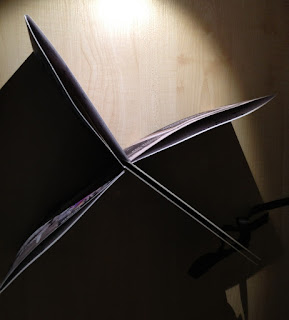
The constatina effect works really well in my opinion!
The final book:

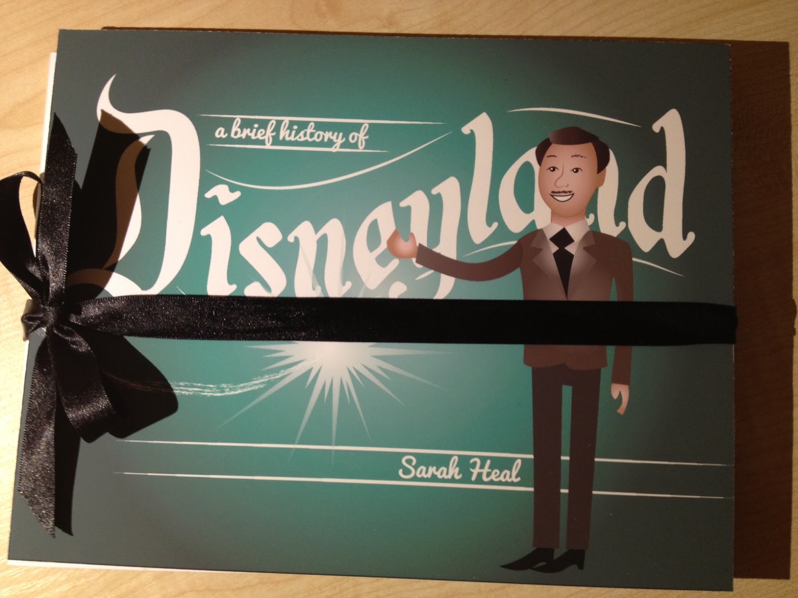


I am pleasantly surprised at the final outcome of my book - but you don't have to read between the lines to see that I am thoroughly disappointed at how much I messed up on what was supposed to be my best work so far - I would even go so far as to call it my worst work. I hope that it successfully fulfils the assessment criteria. I know what steps I need to take next time to NEVER let this happen again - I want to be proud of my work!
My evaluation can be found here.
Thanks for reading
Subscribe to:
Posts (Atom)