Taking my idea of Capitalism and Consumerism from my essay, I would like to show how graphic design can enhance the idea of consumerism & marketing by promoting the sale of products that perhaps do not live up to their graphic presentation.
I have decided to show this by packaging a low-quality, inexpensive, plain t shirt in packaging that makes it 'desirable'.
It can be argued that this new t shirt culture is based around hype and respect for the companies & designers themselves as opposed to the products and designs. It can also be argued that these plainer components are bought to achieve an entire look in it's whole, and the users see this look deserving the expensive price tag. Overall, we can see design playing an important role in, what the users see fit as justifying a perhaps average quality, almost plain item as a more desirable item for a worthy price.
Logo Design
Determining my 'brand' name from my research, I have decided to go with the name 'Indoctrinate' based on brands like OBEY, HYPE etc.
I have been making progress on the logo itself taking aesthetics from old cartoons also inspired by modern illustrations by McBess and Johnny Cupcakes.
Koko the Clown ghost character - removed for crossed ethics with plagiarism:
Lid of tin
Using the skullhead character and logo elements, I diverted the logo back to its original circular shape to fit on top of the circular tin better:
I wanted the logo to be free-flowing and intertwined with itself. I wanted an image of a brain in the centre, visually conveying the idea of indoctrination.
Here is a random mood-board of ideas quickly sketched after watching a few old cartoons:
There is an almost direct sketch from the animated Snow White by Betty Boop that I decided to not include because it was too similar. Although the idea of the tin is that it takes literal inspiration from current trends, the idea portrayed in my essay that the consumerist cycle a lot of the time actually recycles previous ideas and concepts, I felt like it crosses paths with my ethics as a designer to not plagiarise somebody else's work. So I created the skull head character to demonstrate it in a less literal way. I wanted a quirky array of different typefaces, and I wanted to create hype around the packaging itself, selling it as 'limited edition'.
A closeup of the skullhead character.
Here, I am working out the circumference of the tin using Pythagoras theorem! Who knew I'd actually use it again... I am also sketching out the 'limited edition' section of the tin.
Here is my sketch of the twirly arm of the skeleton face character. Not sure what will be on his sign yet... perhaps something about the fact the tee was made in GB?
I started scanning in my sketches ..
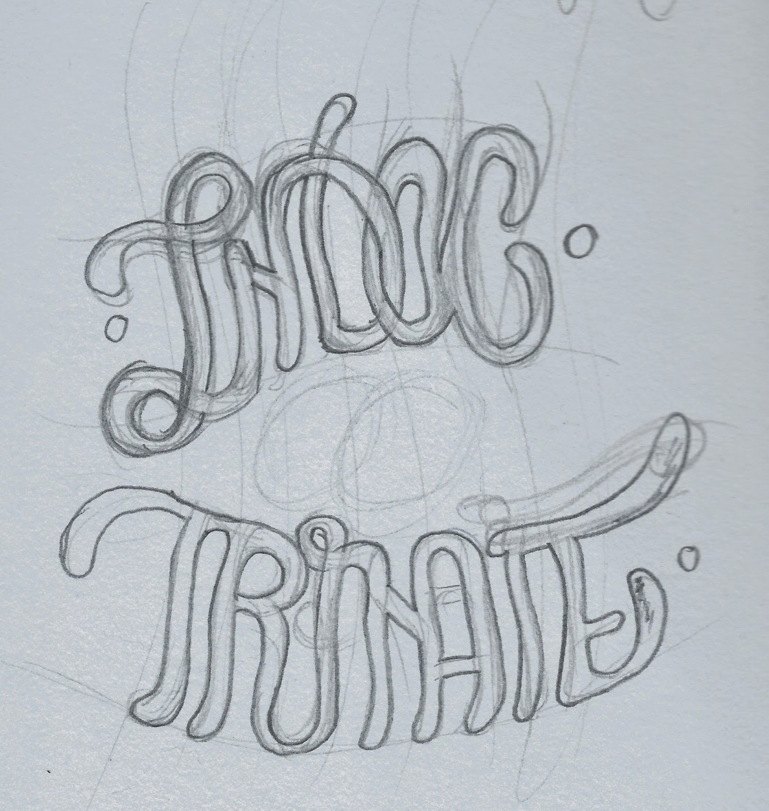
Because I couldn't find a font I deemed suitable to convey 1930's style cartoon type, I decided to sketch it myself.
I scanned in my sketch, fiddled about with it on Photoshop, ensuring that there was little to no grey, and that all interfering pencil marks weren't visible. This meant it was ready to be clearly live traced into a vector on Adobe Illustrator.
Digitisation
I started out by mapping the size and shape of the graphics strip, and where the window will be placed.
Here, I am dropping in my hand drawn lettering.
Here is a closeup of the digitisation of my skullhead character! It took a few layer masks to ensure he could have the 3D element to the holes in his eyes.
I also did some quick cartoon eyes. Here are all the elements all together so far.
***
***
So far, we have the skullhead character, his twisted arm and sign, with the full digitised logo and dark clouds across the top. I decided that the logo would work best as one long word when it came to the body of the tin itself. I expanded the strokes on the logo, and fiddled about with each of their boundaries to vary the line thickness on the logo, to hopefully show a hand drawn element of a permanent marker style?
A close up of the logo.
I then added a little few more bits and pieces inspired by artist McBess such as the musical notes, anchor and 'x's. I also added loads of dots and mini stars for a textured effect.
Here is the final design of the main body of the tin. I decided to do two panels - one that promoted the limited edition packaging and one that promoted the company itself - none that actually promoted the product itself, labouring my point that consumerism is mainly flowed upon hype and associations with desirable companies instead of interest in the product quality or style itself.
Lid of tin
Using the skullhead character and logo elements, I diverted the logo back to its original circular shape to fit on top of the circular tin better:
Label for t shirt itself:
Again, only using the existing illustrative elements from the tin and the skullhead character, a simple tag was created, clearly displaying the price - £25.00!
The finished article:
I had a couple of problems with the assembly, just petty things like matching up the sticker with the tin and making sure there were no bubbles! But all in all a good outcome!


