Tuesday, 7 May 2013

OUGD401 - 'A Brief History of...' Ideas, research and development

'From Theory Into Practice'


Design, develop and produce a publication entitled; ' A Brief History of...' (completed with a subject of your choice).
A publication can be anything you can read and extract information on. This includes blogs, websites, motion graphics, books, & magazines etc.

  • Think about your audience!
  • Be creative with your format!
  • Think outside the box!
The content of your publication could be based on something from what was studied in the 1st semester, but basically just has to show a deep understanding of a contextual subject or movement and it's impact on the audience and society of the time.

Evidence a deep knowledge of the...

  • Historical & chronological information
  • Social and cultural attitudes
  • Technological advances
  • Political attitudes

...of the time.

Be visual and experimental! Fulfil your choice of content and have fun with it.

Module deadline/ studio deadline: 7th May 2013.

-------


After reading the brief, I have to decide what contextual subject to visualise in the publication.
I know straight away that I don't want to design something plain or modernist, and think I can be more experimental and engaging if the subject is more obscure.

I have quickly made a list of obscure art movements/ contextual subjects that I know I can provide depthy research and that I think would translate well visually:

1. Victorian Modernism Newsprint

  • turn of the 20th century
  • invention of the telephone, lightbulb and electricity. 
  • Train travel and concrete are invented.
  • steampunk-style inventions and innovations in steel architecture.
  • Focus on Parisian world fair in 1889 - perhaps create newsprint advertising new technology.
  • Utilise paper craft to recreate viewfinders?

2. 60's/ 70's Bohemian Psychedelica

  • photo album/ scrapbook of festivals in San Francisco
  • Diary?
  • Documentation of Woodstock Festival

3. Dadaism

  • Book made out of wood?
  • sculpture?

4. Avante Garde cinema

  • some pages to be printed on acetate like slides of a film? 
  • experiment with light in book...

5. Punk

  • Could be book about punk written in formal institutional format, savaged and vandalised in the style of anarchy.

6. Disneyland ( a personal interest ) 

  • book could transition from 2d to 3d, to represent cartoon to screen to theme park.
  • Could also transition from black and white to colour to represent timespan.
  • Interactive elements and removable parts.
7. Surrealism
  • Plain format style of book, printed in reverse
  • features book box but slides out wrong side (back to front)
  • Book would feel uncomfortable, and unfamiliar to the reader.
  • Boring, grid formatted pages would get progressively distorted.
------
After showing all of my ideas to my peers at the crit on 19th March 2013, I decided to go with the history of Disneyland book. My peers said that because I had so many different and fun ideas for the Disneyland book, and because it was a personal interest so I had extensive knowledge, that this would be the most elaborate and successful idea.

Why Disneyland? How does this relate to art/ design?

  • The birth of Disneyland saw a massive surge in consumerism & advertising
  • Great innovations in art technology were made purely for Disneyland with the invention of the animatronic etc.
  • It turned the amusement park into an art form, and used art & engineering to immerse people in the art.
  • New advances in architecture were made because/ for Disneyland.
  • Several inventions such as Doritos were created and marketed well because of their affiliation with Disneyland.
  • Disneyland increased interest in the Disney company and so became one of the first companies with an obsessively loyal fan base.
To see all of the visual research to this book, click here.


Because I already knew so much about Disneyland, I began starting to list all the things I would want to include, and try to fulfil the assessment criteria. I also knew that I wanted to feature pop up/ interactive paper elements to integrate the 'fun' vibe of the book and so I was keeping in mind what kind of things I could include for these features.
My project proposal form 

I began writing up a detailed timeline of what I thought was all of the key elements to include. This included things like big opening days, innovative inventions/ attractions.


 I also wrote up a possible chronology of pages. I estimated around 7 or 8 pages would be required. I started to produce some (really rough) sketches:

This double page was to integrate all of the greatest rides/ attractions in one place. It features lots of attractions from the 1959 Tomorrowland expansion. I was going to do movie poster style artwork with dramatic perspectives.

This double page featured the designing and the 1-year rushed build of the first Disneyland in time for opening day. It would have blueprints falling down the page and a long queue. I thought that the queue could be in the foreground and could be 3d and have layers of these. The page would be in layers looking at the railroad station and the castle in the background.

I found myself rather stuck after just 2 sketches. I couldn't visualize how to tell my story, even after countless lists I had hit a wall. I decided to take my sketches and a couple of mood boards to the peer-ran crit:


As I didn't really know what was wrong with my idea, I just knew it wasn't working, I didn't really receive very much constructive feedback and didn't come away with any more ideas. On paper, my idea sounded strong.

I plodded on with more sketches, and decided to do the bits I knew I could do. I wanted somewhere to include a cartoon picture of Walt Disney himself, and so I began sketches and development for that.


I wanted to make Walt cartoon-like, most resembling something in the style of Josh Agle (Shag) because his artwork is Disney friendly, has a strong 1950s yet contemporary style, which is the era Disneyland opened and much of it's marketing to this day is in this style.
In this image I am playing around with Walt's appearance.

Here I am doing a few sketches for people in the crowds & the body of Walt. Some people would have to be in the foreground at least, so I knew that I would have to produce drawings for them.

I liked the idea of re-tweaking the Disneyland logo for the front cover.

I wanted a lot of the graphics to be like the ones found in the Disneyland park itself. This meant very typographic based banners and designs to decorate the book with. 

A couple of crude sketches in the style of Shag for people of the crowd. These people are dressed typically in fashion of the 1950s, something the crowd might have worn on opening day.

I decided to digitise a couple of my sketches, and digitally develop them so I had more unique images to work with.


By tracing over my sketch with the pen tool, and playing around with different line points and gradients, I was able to create an image of Walt Disney that remotely represented him! I was really happy with the result, which gave me a bit more confidence in my idea. I posted the image to the Graphic Design page on Facebook for some feedback and there were a lot of positive responses - a few said he looked a little bit too young/ a bit too surprised because his eyebrows were so high. Every reference photo I found and video I watched his eyebrows really are that high!


It was hard creating something with regrettably hardly any planning. And although I was happy with the result of this page, it was created without any knowledge of paper size and would soon suffer from cropping and layout of the final design.


From my sketch of the 1950's lady, I was able to use the same techniques to create the digital image. The different arms and legs were to be added when I knew exactly where she was going to go!
From the digital version of the 1950s lady, I was able to create a 1960s lady and a girl with accurate 1960s merchandise.
Again, by using the same techniques, I digitised the sketch of the 1950's man, complete with bowling shirt.

After another mini crit, I was growing increasingly worried about my design, as it really wasn't materialising. Other projects were getting in the way, and poor time management meant that my beloved Disney book was falling behind. I decided that I had to not do a pop up book, as by this time there was not near enough time to refine the pop ups as well as everything else that needed to be done.

I changed my idea, as I still wanted something that would be of interest to the typical Disneyland fan - so I chose a carousel book:

Examples


This would mean that there would still be an element of interactivity and a 3D effect but would be a lot more time efficient, as the 3d effect could be developed out of one page.

So I finally started to develop, as now I had no choice but to just go with what I had already decided. 

The chronology of the final Disney book were refined down to :

page 1 - Disneyland opening day speech on a plaque
page 2 - 'a gleam in Walts eye' - an insight into where the idea for Disneyland came from
page 3 & 4 - why Walt was discouraged from the idea of Disneyland - to put into context the radical idea and development of Disneyland.
page 5 & 6 - development, building and opening of Disneyland
pages 7 & 8 - exhibition of all the greatest innovations/ attractions at Disneyland and the opening of all of the different parks.

As I started to sketch and develop digitally, I quickly ran out of time.
I decided to abandon the idea of a 3 tier carousel book, and have it double sided instead.
This would mean that there would now be no fiddly/ time consuming paper engineering - just a double sided document.

Developing a drawing of the Jungle Cruise ride. It was important to me to include 4 or 5 rides on the opening day page that would represent the mix of cultures in Disneyland and what that meant in an all-American californian community. 

screenshot of the development of pages 5 & 6. On the left I am drawing the Main street station and on the right I am just starting the Jungle Cruise ride.


Copying and pasting a crowd together for background.


Using a screenshot from the Disneyland tv show, I used the pen tool to trace around the lettering, and then staggered each letter over a waved line like my original sketch.


 Using all the same techniques, IE the pen tool and the gradient tool, I was able to trace over a photograph of the Disneyland castle to use in my book.


Using the same image of Walt, I was able to change his pose and put him in many different backgrounds. I decided to start using old black and white photography in with my illustrations to save time, and I really liked the way my images were coming out. This also meant that it was a bit more historically supported.


Drawing 2 girls to go in the teacups.


 I started integrating all of my images like this. This page being the page showing the different 'lands' of opening day. I used different layer masks to mix the photo with the illustrations, such as the rocket top right. I used the clone tool on Photoshop to get rid of the real rocket in the photo, and replaced it with mine in illustrator. I repeated the image and used a layer mask to include the 2 men in the foreground of the picture. I played around with the layer mask to make my illustrations part of the images. All of the photos I included are pictures of Disneyland park.


I really regret not pacing myself and giving myself time to work on this book, as I missed out on vital feedback that could have made this book what I had originally visualized. Because of this lack of time, I had to move more quickly and subsequently less intricately. IE, whatever I drew I would have to go with it and not compromise.

The final book in stages:

I always wanted to include the opening day speech to the first page of the book, as I thought it was a really suitable introduction. I tried to make it in the style of Disney with the Tinkerbell glitter and shine. I also used a font that to me resembled the cursive script like Disney's handwriting.


The second page features an old 1950s television showing the Disneyland show. In the bodycopy, I talk about the idea of Disneyland and what Walt envisioned. This would explain the context of the Disneyland development and design.


The third page features a photograph of Coney Island in the 1950's. Lots of existing amusement parks of the time were in decline and were dangerous, dirty places that you wouldn't necessarily like your kids to roam free in. This is exactly the opposite of what Walt envisioned for Disneyland. Because of this amusement park decline though, lots of people predicted failure for Disneyland. I also talk about the second world war, and the financial struggle the country was going through. This meant that there wasn't a market that were willing to part with their money to visit Disneyland - in theory.


The fourth page narrates the book and carries along the story to help the reader.


The fifth page is a photograph of main street in Disneyland on opening day, with a collage of my drawings as well. It shows Walt giving the opening day speech, and my historically accurately dressed crowd behind.


The sixth page is continuing the same thing, exhibiting the most diverse attractions of opening day.

The last double page shows the Matterhorn, the submarine voyage, skyway and the monorail on a photograph of a landscape similar to the one Walt envisioned for this part of Disneyland. I include a fairwell tagline for the book but there is more.

I needed to include something to make this more historically educational and accurate, so I included a comprehensive and accurate timeline on the back of these pages:


This was in the same font and style as the other pages of the book.

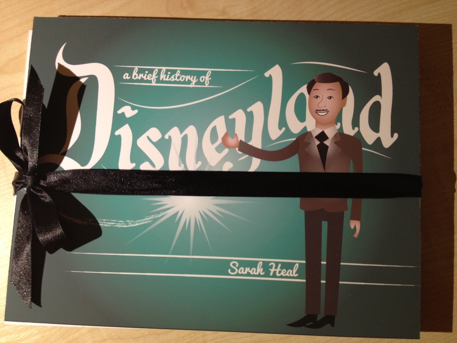
The finished front cover design didn't require any different techniques previously used in the book.
The front and back cover would be ever so slightly bigger than the pages, and would be mounted on mountboard. It wouldn't need to have a spine, because the book opens both ways.


Printing

I managed to get my book printed at the very last minute, and so I didn't really think about the paper stock other than it had to be card. Now that it is printed , I think that I would have chosen this stark white stock anyway, as this kind of book is best suited to clean, crisp bleach card.

I printed it by reprographics and assembled using a scalpel and double sided tape - spraymount caused it to curl and pritt was not strong enough.

I encountered a couple of problems in assembly- in particular putting the back pages onto the front pages- at first it was wonky and I decided to assemble the back pages one at a time. 

The constatina effect works really well in my opinion!

The final book:


I am pleasantly surprised at the final outcome of my book - but you don't have to read between the lines to see that I am thoroughly disappointed at how much I messed up on what was supposed to be my best work so far - I would even go so far as to call it my worst work. I hope that it successfully fulfils the assessment criteria. I know what steps I need to take next time to NEVER let this happen again - I want to be proud of my work!

My evaluation can be found here.

Thanks for reading


Monday, 6 May 2013

OUGD401 - Essay - Choosing a particular period from 1800 to the present, in what ways has art or design responded to the changing social and cultural forces of that period?


Sarah Heal - Level 4 - CoP

Choosing a particular period from 1800 to the present, in what ways has art or design responded to the changing social and cultural forces of that period? ( 2 specific examples )


 ‘The emergence and flowering of a psychedelic style coincided with one of the most revolutionary periods in the twentieth century’ - (Grunenberg, 2005, p.7)

 Art and design during the revolutionary mid sixties to early seventies undoubtedly correlated to the cultural and social goings-on of that time. In a time shifting from suits and shift-dresses and days at the office to bohemian fashions, recreational drug use and the practice of 'free love', art and design was most definitely at the forefront of this riotous decade. ‘…in America alone, art historian David Kunzle estimated in his book, Art as a political weapon, that between 20,000 and 40,000 different poster designs were produced during the period 1965-75’ - (Aulich, 2007, p.224).

 ‘The free wheeling shapes, exaggerated acid colours and pervasive formal entropy of psychedelic art continue to be met with aesthetic revulsion and intellectual arrogance’ - (Grunenberg, 2005, p.7).
This essay will reject the stereotyping that hippie/psychedelic art receives, - that it is a culture derived from laziness, unenlightened and absent minded rebellion. It will also begin to explore the connections and influences between the psychedelic art movement/hippie art culture to what it is believed was the cause of it’s birth: the Vietnam war (certainly in America), music and hallucinogenic drugs. Hopefully, it will be shown in this essay that the Hippie movement had a political engine, not just a recreational one. Wes Wilson, the San Franciscan poster designer, can be argued as a prime example of this point. It will also be observed how Art Nouveau style was revived in this movement.

----------

 ‘By 1968, American involvement in Vietnam had become a focus for discontent’ - (Aulich 2007, p.223).
 As America's involvement with the brutal Vietnam War increased, it became a national centre of attention for frustration and sadness. Since America had recently been involved in two major world wars, there was somewhat of a backlash. With this in mind, along with an ever-growing market of youth (the ‘birth of the teenager’ only being a decade earlier in the 1950’s), the US anti-war movement gained momentum. There were sit-ins and demonstrations of students and other young people burning their drafts in opposition (the average age for draft was 19 years old, so was something that directly affected them).  ‘Growing opposition to the war in the United States led to bitter divisions among Americans, both before and after President Richard Nixon ordered the withdrawal of U.S. forces in 1973.’ - (uncredited, 1996-2013 ,Web). The war was not only overbearing in it’s numbers, but was frustrating and none progressive on the front line: ‘U.S. soldiers commonly became frustrated with the fighting conditions in Vietnam. Many suffered from low morale, became angry, and some used drugs.’ - (Rosenberg, undated, web).
 In the UK, however, this countercultural and political backlash had been going on for some years: ‘The counterculture was apolitical, as far as party politics was concerned because most politicians were seen as lying hypocrites, serving vested interests, not the people. However, it was active in issue-based campaigns: CND, which many of them were involved in during the early 60’s, and the anti-Vietnam war campaign which grew out of that.’ - (Miles, 2011, web) and so the already existent underground scene started to gain energy and dared to put it’s head up with a radical change in attitude, and did this by showing themselves visually through art...
‘The straight, consumerist lifestyle was not to their liking, but they did not object to others living it’ - (Miles, 2011, web)
 Collectively on both sides of the Atlantic ocean, this peaceful rebellion brought many opportunities for art and design to communicate the passionate message of the people: ‘[the anti war movement] found a voice in alternative styles of behaviour, dress, music & underground graphics in America and Europe’ - (Aulich, 2007, p.223). Through encouraged experimentation, along with the growing popularity of multi-media, a whole new array of art was being produced in this free spirited environment.
 Alongside all of this was the increasingly popular use of recreational drugs because of this new liberal attitude towards life: ‘Psychedelic artists were deeply entrenched in popular culture, while at the same time being influenced by the mind- altering effects of drugs and participating in counter- cultural activities’ - (Grunenberg, 2005, p.7). So perhaps inevitably, the hallucinogenic visionaries filtered through into the arts through crazy patterns and unusual colours in light shows, and into the illegible curves of psychedelic lettering (found in the works of Lee Conklin, Wes Wilson, & Bonnie Maclean, to name a few). 
 By identifying a psychedelic poster, you are (typically) looking for a lack of grid for typography, distorted, almost illegible lettering, a kaleidoscope of a colour scheme and art-nouveau or folk-style imagery. From this description, you can imagine that these aesthetics are closely linked to drugs such as LSD.
And so, as a glorious result of all of these factors, the psychedelic era was born.

---------


 ‘The underground was a catch-all sobriquet for a community of like-minded anti-establishment, anti-war, pro-rock'n'roll individuals, most of whom had a common interest in recreational drugs. They saw peace, exploring a widened area of consciousness, love and sexual experimentation as more worthy of their attention than entering the rat race.’ -(Miles, 2011, web)
 An example of the psychedelic art in the UK would be ‘Stop Nuclear Suicide’ by FHK Henrion (1963). [Image 1 below] It’s neon yellow shades blended with darkest black is unusual and startling like most psychedelic art and gently reflects the illusive visionaries of psychedelic drugs. The innovative overlay of different images shows rebellion against conformist modernist art reflecting the free-loving people of the time. [‘There seems to be a deep-seated suspicion towards the psychedelic arts formal exuberance and it’s suspicious proximity to popular culture, suggesting the continuing domination of high modernist and formal principles’- (Grunenberg, 2005, page 7) (of course this photo technique preceded this time, but definitely became more apparent through alternative art such as this) . As this technique has been used, the iconic mushroom cloud stem mimics and blends into the nose of the skull image in the background almost making the two images become one. This could represent the association between nuclear weaponry unto others as suicide to yourself. This eery and powerful image is branded with the CND sign, another confirmation of a definite link to the anti-war scene. 
The poster was designed to symbolize the Campaign for Nuclear Disarmament in general and what they represented. It was banned by London Transport for violating their conditions against showing images that could cause controversy. For what would be considered as not very offensive today, was radical and rebellious back then, which gives an interest into how times have changed. Ironically, it could be argued that the fact that times have changed, could be owed to campaigns such as this back then.
 Another example of this would be the ‘Easter March’ poster by Ian McLaren from 1966. Visually, it can be noted that it is heavily influenced by Op art/ psychedelic styles because of its illusive or ‘trippy’ black and white imagery. Although aesthetically this is definitely more of a modernist styled example, it could be argued that this is because it was created for a wider audience, to possibly recruit more followers for the campaign. The CND logo is worn proudly in the top left hand corner.

 Across the Atlantic, at the epicenter of the US hippie movement in San Francisco was poster artist Wes Wilson.
Wilson is renowned for his influential involvement in the psychedelic music scene through his artworks. As he was repeatedly commissioned for posters for protest gigs hosted by Bill Graham, it made him one of the most notorious artists of this era (since Graham was the most popular host of these ‘happenings’). We can consistently see through many different examples of his work the typical distorted lettering, wacky colour schemes and monochrome imagery that portray this strong psychedelic style; ‘[Wilson] had no real formal training as a graphic designer....To the San Francisco designers, legibility was considered secondary to the look and feel of the overall design’ - (Brignall, 2013, web) . 
The fact that most of the bands listed in these pieces are those that were supporting the anti-war movement shows the interdependence between the two worlds. This point in particular can be observed in his poster for ‘A Tribal Stomp’ [2nd image] - a poster commissioned for a music night held in ‘Fillmore Auditorium’, the infamous hippie music hall in San Francisco. The bands listed in this image are ‘Jefferson Airplane’ and ‘Big Brother and the Holding Company’ - both heavily supportive of the anti-war movement through their songs [Jefferson Airplane’s; ‘Volunteers’ is a good example of this]. In this image, although this particular image lacks colour (I could not find a coloured version with a decent size), the actual poster contained purple, yellow, red and blue with a white background, free from the boundaries/ rules of general modern design.
To Wilson, every last inch of the poster was an opportunity for design, again, an example of peaceful rebellion against conformity- a common trait amongst the hippie counter culture. In that image in particular we can see no acknowledgment for even the simplest of graphic ‘rules’ such as alignment and border space, or even a limited choice of font styles! : ‘White space was considered bête noire to the psychedelic poster designer whose style of work was intended as a reaction to the prevailing “clean” Swiss style of typography!’ - (Brignall, 2013 web) .
The Native American Indian image in the centre was often a theme in San Franciscan art of this time. There are no unearthed details on the reasons behind this but it could be considered that they are often included for sentimental reasons/ legacy reasons or possibly as a symbol as a fight for freedom. 

 Another example of these points would be the 3rd image listed below from 1967, another poster for a night hosted by Bill Graham. The girls hair flows freely about the page,  and because of this shares the general aesthetics of a hippy girl (Janis Joplin from the band Jefferson Airplane, perhaps?). The hair can also be seen as deeply inspired by art nouveau works by Alphonse Mucha such as ‘Job’ (also below). The rekindling of this design style could be because of the use of drugs also in the Art Nouveau period and so would have appealed to artists in the 1960’s. 
The artists listed in THIS poster are also those involved in the anti-war movement. 
You can also see the stark colours of black and yellow, like in ‘stop nuclear suicide’. The great tonal range almost takes your breath away, and is certainly eye catching. 
Again, you can see that the lettering is almost unreadable, but would have been admired for it’s creativity as opposed to judged for its illegibility back then. 
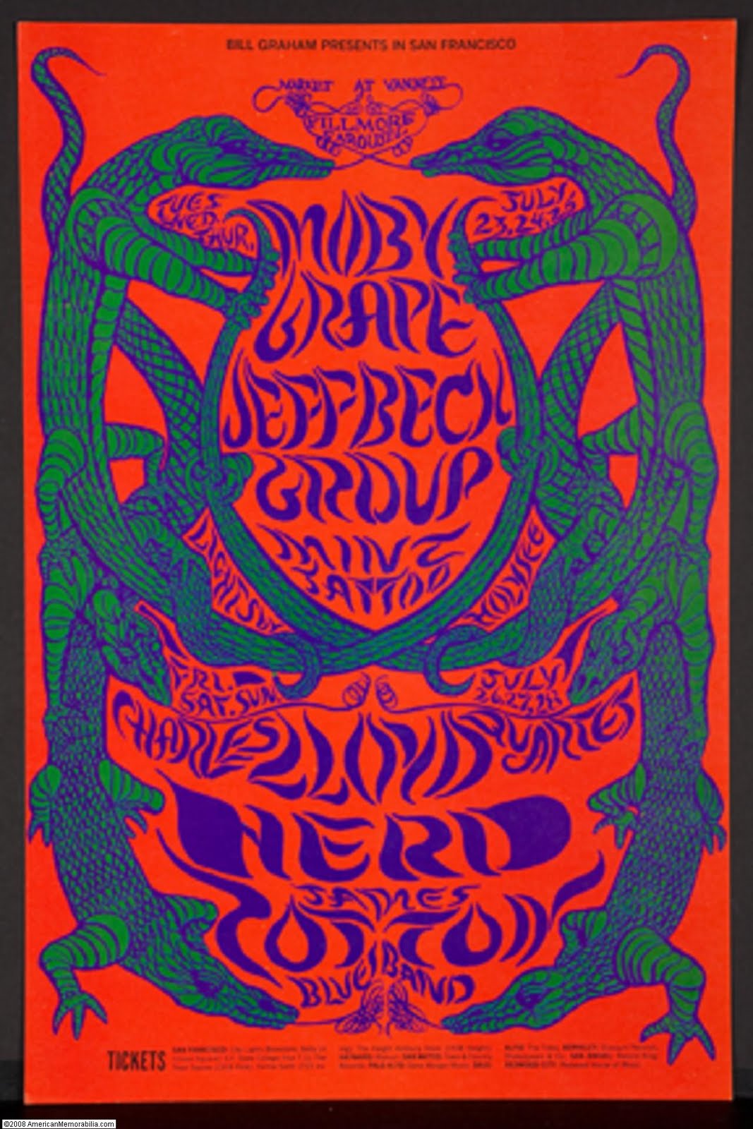
 One last example of this kind of art would be the ‘Moby Grape’ poster by Lee Conklin from 1968 (listed below). The first thing to comment on about this piece would be the colour scheme. The simultaneous contrasts of the colours almost make them perpetually vibrate in front of your very eyes. This stimulating illusive technique has been purposely executed to catch the eye of the viewer, and also reflects the experimental and daring nature of the artists, even if it did mean that no one wanted to read the poster! An online article explains about how this was a commonly used and inspiring technique among many of the designers of the time, in this case Victor Mosoco. Secondly, the lettering is almost unreadable as it follows the organic curves of the design, resembling the distortion of aesthetics while under the influence. ( although arguably the most important part of the poster, the typography always would typically come second to the imagery in psychedelic posters) The strong asian style in this poster also seeks intrigue and interest from the viewer, and would successfully appeal as the global fashions and styles all blended almost into one in this era. Notably, again, this particular dance night is hosted in Fillmore Auditorium. Lastly, the strange, puzzle-like imagery would appeal to the viewer because it asks them to work out and define what is actually going on in the image! This optically illusive type of imagery was very popular because of provoking nature, hence why it was often affectionately named ‘the thinking persons art’. 

 In basic terms, the kind of anti-uniform, anti-war hippies, (essentially) were usually those who were brave/ careless/ free enough to experiment with these illusionary drugs, and this was a very large market. Posters like ‘Moby Grape’ would catch their eye because their interests were largely affected by the drugs they were taking. In the same way, psychedelic music mimics the sound of normal music but while under the influence of drugs and so the characteristics are usually long, drawn out, distorted and are, in general, an audio version of the posters!
------------

 ‘The underground papers were produced entirely for idealistic reasons, often communally, and the staff were frequently not paid.’ - (Miles, 2011, web)
The psychedelic art movement could have also been described as ‘disposable’ because of it’s rapidly moving culture and ‘free’ because of its non-profit organizational ethics. ‘That was an important part of the early scene—nobody was super demanding about money.’ - (Marks, 2011, web). Every day somewhere there would be a ‘happening’, ‘sit in’ or a gig, mostly free of charge or very cheap admission. The anti-capitalist frame of mind made this both a successful and unsuccessful time. Successful for humanity and benevolence, but in terms of making a living, very unsuccessful. For example; Richard Branson ran an underground magazine business at this time with little to no profit from the basement of a church (Student Magazine), and Wes Wilson often only charging $60 for an original print run of around 300 for his works.  
Wilson describes in an online article how quickly and cheaply he had to work to keep up: “Normally I had to design and deliver printed posters in a matter of a week, or even days. Within three or four days of getting the billing, I had to have the poster at the shop getting printed. For producers like Chet Helms and Bill Graham, that was usually as quick as they could get these bands scheduled. It was just tough to schedule two or three bands way in advance for some reason. I don’t know why, but that was just the way it was. Once in a while, I remember Bill would be real happy if he had over a week in advance and would perhaps have photos for a poster. That was a big deal. It was a pretty fast-moving business in those early days.” - (Marks, 2011, web). This was again, rebelling against everything they’d ever known, anti-capitalist, anti-conformist and most importantly, altruistic.
 Although, non-profit and sometimes non-marketable (banned/ controversial imagery), the psychedelic art certainly made a difference. As this online BBC article shows: ‘1969 - Ho Chi Minh dies. President Nixon begins to reduce US ground troops in Vietnam as domestic public opposition to the war grows.’ -(Uncredited, 2013, BBC web). Which is what sets this era apart from others, especially in the materialistic western world. Back then, it was ‘cool’ to take drugs and drop out of school and to help others! And it wasn’t just because it was trendy, either. It was because people wanted change. This can be seen visually through the art, all you have to do is look at psychedelica's preceding  artworks to see the sudden difference. 

--------

 ‘What had started as protests against the Vietnam war expanded to something far wider. The talk was of revolution. Everything about modern capitalist society was suddenly called into question.’ - (Hoyland, 2008, web)
It can be blatantly observed from a design point of view the great impact that the hippie counter cultural movement had on the prevailing modernist social norm and ethics, but also from a societal point of view, too. With the great shift came the art, which then became a symbol of the revolutionary idealists and events of that time. The art is no different to that in it’s own metaphorical way in that it breaks all rules of art and design whether the viewer agrees or not - it’s determined to get it’s message across at all costs. Unlike punk or skate culture, hippie culture was peaceful and did not thrive on negative energy, but focused on making a positive change for liberty and equal rights. The determination and outlandish bravery of those who made it possible can only be greatly admired for the changes they made back then, and the affect it’s had on our ethics today. In an era like no other it’s safe to say that that generation changed the world for the future, enumerating the liberties that nearly everyone we know in the western world is not denied today. The art is so synonymous of the time, it cannot be mistaken for anything other than psychedelic. Will we ever have another social revolution as great as the psychedelic era in the western world again? 

“to fathom hell or to soar angelic, just take a pinch of psychedelic” - Humphrey Osmond.


(Summer of Love: art of the Psychedelic Era)


Bibliography

Grunenberg, C (2005), Summer of Love: art of the Psychedelic Era, Tate Publishing, London.

Aulich, J (2007) War Posters - Weapons of Mass Communication, Thames and Hudson, London.

Uncredited, (1996-2013), Vietnam War, history.com/topics/vietnam-war, [web]

Rosenberg, J (undated), Vietnam War - A history of the Vietnam War, About.com, history1900s.about.com/od/vietnamwar/a/vietnamwar.htm [web].

Miles, B (2011) Spirit of the Underground: the 60s rebel, Guardian News & Media, guardian.co.uk/culture [web]

Brignall, C (2013), The Psychedelic poster art of Wes Wilson, WordPress/BytesForAll, Weswilson.com [web] . 

Marks, B (2011) Psychedelic Poster Pioneer Wes Wilson on the Beatles, Doors & Bill Graham, Market Street Media LLC, collectorsweekly.com [web].

Uncredited, (2013) Vietnam Profile: Timeline, bbc.co.uk [web]. - although uncredited, I feel that this is a trusted source as it is from the BBC facts website which is regularly updated and amended. 

Hoyland, J (2008) Power to the People, Guardian News and Media Limited , guardian.co.uk/music/2008/mar/15/popandrock.pressandpublishing, [web]

Images

‘Stop Nuclear Suicide’ by FHK Henrion (1963):


‘Easter March 1966’ by Ian McLaren (1966):


'A Tribal Stomp' by Wes Wilson (1966):


Poster for a Bill Graham production by Wes Wilson, (1967):


'Job' by Alphonse Mucha, (1898): 


'Moby Grape' poster for Bill Graham production by Lee Conklin, (1968):


-----------------


Monday, 8 April 2013

OUGD406- Design is about doing - research


Brief

LIVE BRIEF: SECRET 7"

About Secret 7"

Secret 7" is a project that combines music and art. Agter their success in 2012 the team are back with a new line up of artists, a new set of tracks and a new charity partner.

THE BRIEF

Secret 7" are inviting creatives from around the globe to take inspiration from one of the tracks from the artists below and design an original 7 inch vinyl sleeve.

The sleeve must not feature the name of the artists or title of the track.

ARTISTS
  • Public enemy
  • Elton John
  • Naz
  • Jessie Ware
  • Hiam
  • Laura Marling
  • Nick Drake

Background/ considerations

You need people to see your work and the essence of graphic design as communication. There is no value producing work for it to be placed in a draw! Often the best work or best ideas are the ones that people have seen. You must get used to distributing your work at any available opportunity.

Remember, DESIGN IS ABOUT DOING.
This is an opportunity to visually and conceptually exploit every possible angle of your ideas. We are expecting a visual feast of ideas before you even consider resolving the problem.

Mandatory Requirements

Full Resolution
Examples of the sleeves you didn't select to enter.
A minimum of 30 thumbnail possible design treatments and supporting design development work.

Documentation on your blog and design sheets.

Deliverables

FIVE visual variations of the record sleeve.
Supporting work.

Studio deadline 15th February 2013
Module Deadline 3rd May 2013


Monday, 18 March 2013

OUGD406 - Speaking from experience

Research for our Freshers' Bible

For our freshers 'Bible'/ guide to being a student in Leeds, we wanted a design that would appeal to our audience of aspirational graphic designers, so we figured our Bible had to look nice and express good visual qualities in it's typography. 


Examples of what we're trying to achieve: 


These are a couple of examples of the kind of publication we want to put together. But we want our tone of voice on the front cover to be almost comically sacred, as if our book will be the only one the student will ever need, as opposed to being advisory but almost a set of rules to live by. The inside may be different to this, but we want the outside to convey this message.


------------


We wanted really nice typography to showcase our advice. A good example of the kind of work we want to produce would be in the style of artist Jessica Hische, because of her vintage-yet-modern style.


Visual Research - inspiration for typographic and front cover designs:


------------

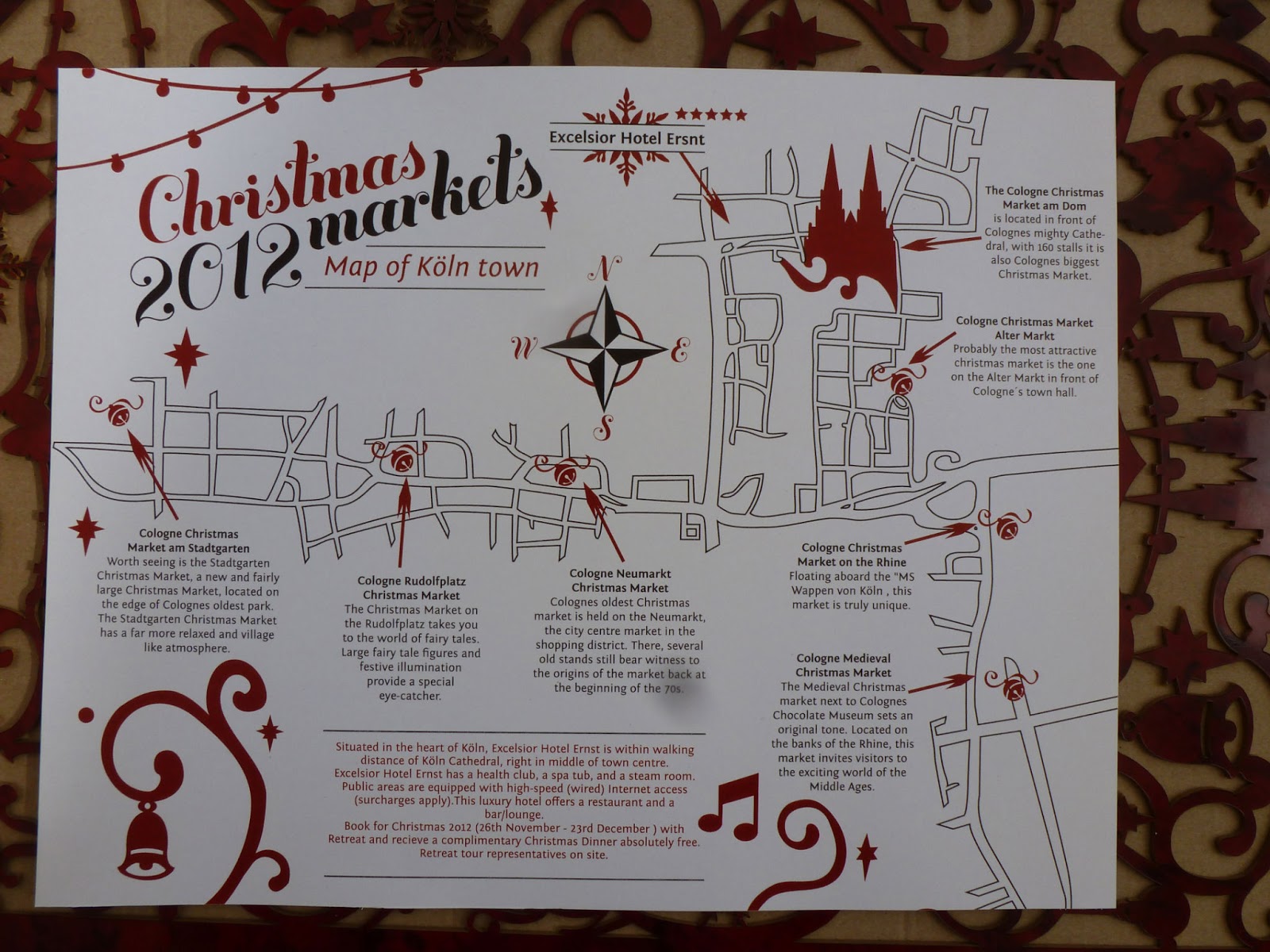
For the inside of our book, we want to feature a large (possibly even as big as A1) of Leeds showcasing all of the places we have mentioned in the book. We wanted it to be customised and simplified perhaps with imagery, like some of the designs below.

 Inspiration for our custom map design:


Inspirations for the Bible front cover design:


Helped me to create banners - really love the utilisation of the old design into new work, I think it works really well.


Loved the illuminated illusion and inspired us to look for gold foiling techniques.

This particularly inspired the '2013' design that was used on the cover


Inspired the feel for a lot of the title pages


Inspired the 'G' for the Graphic design title page.

Inspired the shape featured on the front and back covers

D & AD's 'The Book' is what gave us the initial idea of creating something that looks almost sacred/ biblical on the outside and completely modern on the inside.


Particularly inspired the beams of light on the front cover and back cover design

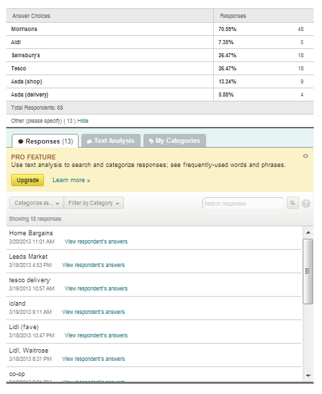
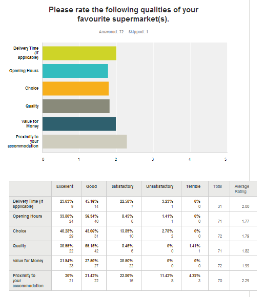
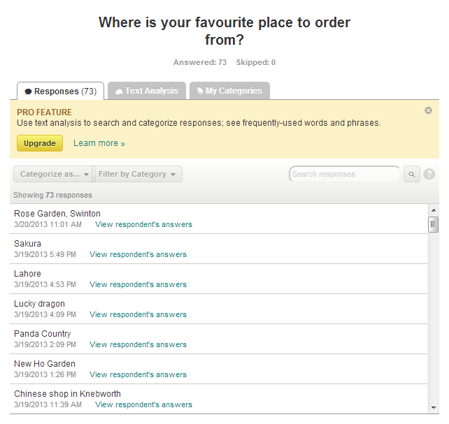
Survey results which helped us throughout making the book: