An introduction to the life of Louise Fili
For my chosen subject, I have decided to research into the life and work of Graphic Designer and Typographer, Louise Fili. Fili is a big inspiration to my work, and many of my other idols' inspiration, too. The re-ignition of the Art Deco style in modern graphic design can be somewhat owed to Fili for her beautiful contemporary incarnations of the what would be old-fashioned styles.
Target audience
Target audiences for Fili include anyone who loves type, good food, good wine and a good time. Her work seems to be everywhere in NYC and she is the inspiration and idol of typographers all over the globe.
Louise Fili is a famous American Graphic Designer born in Orange, New Jersey on 12th April 1951. She is most widely known for her 11 years as Art Director of Pantheon Books (Random House) creating over 2000 book covers there.
As the daughter of two Italian schoolteachers, Fili was instantly inspired by her parents' homeland upon her visit there when she was just 16. She is addicted to all things Italy - in particular Italian 1930's typography and design.
As a graduate of Skidmore College, she began work at Alfred A Knopf from 1975-'76 designing special project books. She then worked for Herb Lubalin from '76-'78 before joining Random House. In 1989 after leaving Random House and many awards and treasures behind, she opened 'Louise Fili Ltd' - the foundations of the company being typography, food and Italy!
In around 1990, she turned her interests to Restaurant design and food packaging. The first customer was the restaurant across the road - 'Prix Fixe'. As payment for her design, she was given an unlimited tab. Some of her customers for her restaurant design work include; Picholine, The Harrison, Noche, Artisanal and Metrazur.
She has been the instructor at the School of Visual Arts for over 20 years. She has also taught at the New School, New York University and the Cooper Union. She also teaches at the SVA Masters Workshop every summer in Venice and Rome.
Fili has authored and co-authored many books with her husband, Design Historian Steven Heller. A list of her books include (via Wikipedia):
- (With Steven Heller) Italian Art Deco: Graphic Design Between the Wars, San Francisco: Chronicle Books, 1993.
- (With Steven Heller) Dutch Moderne: Graphic Design from De Stijl to Deco, San Francisco: Chronicle Books, 1994.
- (With Steven Heller) Streamline: American Art Deco Graphic Design, San Francisco: Chronicle Books, 1995.
- (With Steven Heller) Cover Story: The Art of American Magazine Covers 1900–1950, San Francisco: Chronicle Books (San Francisco, California), 1996.
- Logos A to Z (self-published) 1997.
- (With Steven Heller) British Modern: Graphic Design Between the Wars, San Francisco: Chronicle Books, 1998.
- (With Steven Heller) German Modern: Graphic Design from Wilhelm to Weimar, San Francisco: Chronicle Books, 1998.
- (With Steven Heller) Typology: Type Design from the Victorian Era to the Digital Age, San Francisco: Chronicle Books, 1999.
- More Logos A to Z (self-published) 1999.
- (With Steven Heller) Design Connoiseur: An Eclectic Collection of Imagery and Type, New York: Allworth Press, 2000.
- (With Steven Heller) Counter Culture: The Allure of Mini-mannequins, New York: Princeton Architectural Press, 2001.
- Logos A to Z Three, 2002 (self-published)
- (With Steven Heller) Euro Deco: Graphic Design Between the Wars, San Francisco: Chronicle Books, 2004.
- A Designer’s Guide to Italy. (self-published) 2004.
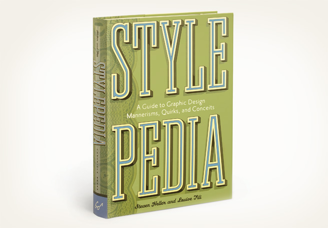
- (With Steven Heller) Stylepedia: A Guide to Graphic Design Mannerisms, Quirks, and Conceits, San Francisco: Chronicle Books, 2006.
- The Civilized Shopper’s Guide to Florence, New York: The Little Bookroom, 2007.
- (With Lise Apatoff) Italianissimo: The Quintessential Guide to What Italians Do Best, New York: The Little Bookroom, 2008.
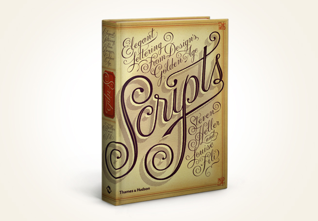
- (With Steven Heller) Scripts: Elegant Lettering from Design’s Golden Age, London: Thames and Hudson, 2011.
- Elegantissima: The Design and Typography of Louise Fili, New York: Princeton Architectural Press, 2012.
Her list of awards include: Gold and silver from the New York Art Directors clubs & Society of Illustrators, The Premio Grafico from the Bologna Book Fair and she has also been nominated 3 times for James Beard.
In 2004 she was added to the Art Directors Hall of Fame. She is also an elected member of the Alliance Graphique Internationale. The list is endless!
Louise Fili on the importance of food packaging:
Louise Fili on the importance of food packaging:
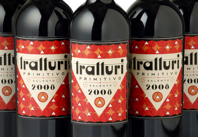
Some of her designs:


This is one of the copyright & acknowledgements pages from one of her books - very creative!


Fili's own Graphic Design 'autobiography', Elegantissima, was co-authored by herself and her husband, Steven Heller.
The Amazon description of the book reads:
"Her lavish and elegant typography, often hand drawn, helps advertise and market such well-known brands as Sarabeth's, Bella Cucina, Jean-Georges, and Good Housekeeping, among many others. Known for her intense attention to detail, her fresh reinterpretation of vintage sources, and her passion for all things Italian, Fili has won numerous awards. Elegantissima, the first monograph on her work, covers the breadth of her nearly forty-year design career and is a must-have for graphic design students and professionals, as well as anyone interested in advertising, food, restaurants, Italy, and books."
On 7th December 2013, an exhibition, also named Elegantissima was hosted by Farmingdale College:
It's a great exhibition that helped the viewer to visualise not only the rightful place, but the inspiration of her works. It also shows the range and the flexibility of the usage of her designs by using patterns as wallpaper, colour schemes in furniture and dotting the area with her beautiful food packages and books. Although distinct in style as in era, it is hard to believe that it was all designed by the same person and the vastness of her design styles.


Video Interview with Louise Fili
Here, a design student interviews Fili about her work and the design process:
Because both her parents are from Italy, she describes going to Italy for the first time as being the ultimate inspiration. She fell in love with the food and graphic design!
She also mentions that 'the sketching stage [of the design process] is very important', because she says it allows the typefaces to form almost by themselves.
She also claims to 'hate repeating' herself in terms of design work, particularly if set a similar brief, but loves the challenge of competing with her own designs.
Video Interview with Jessica Hische
In this video, typographer and illustrator Jessica Hische talks about her inspiration from Fili after working for her for 2 and a half years.
Inspiration of Louise Fili
To inspire my own designs in the same way, I am looking at the inspirations of Fili so as to not try to directly replicate her work!
In this article on the Design Observer Group, we take a look through Fili's collection of Italian 1930's decorative tins:


At first glance, the colour schemes of these tins is the most distinctive influence: mustard, teal and creams paired with thick black/ brown outlines and interesting shapes create the perfect background for these designs. The next thing to be noted is obviously the typography - the identity of the era. From elongated capitals to scripts that look like they were laid down out of ribbon, all united under the flat-colour palette. Fili obviously brings these designs into the 21st century by lessening on the harsh outlines and introducing gentle gradients, that also add to that expensive quality feel.
Further inspiration:

http://media-cache-cd0.pinimg.com/736x/25/fa/f5/25faf5a12d741e7979bdc5e6aeebd302.jpg

Behance.net

http://www.underconsideration.com/quipsologies/

http://artdecoblog.tumblr.com/

http://www.flickr.com/photos/maraid/2268693871/in/set-72157594234429063

http://www.presentandcorrect.com/blog/category/packaging

https://www.behance.net/gallery/La-Diplomate/10326055

http://www.pastiglieleone.com/en

http://www.thedieline.com/blog/2010/11/29/vintage-packaging-coffee-from-the-1800s.html

http://www.thedieline.com/blog/2010/10/15/vintage-packaging-miscellaneous-products.html
Editorial and Layout Design
My chosen concept so far combines the work and life of Louise Fili in an editorial/ magazine layout design. Perhaps I can create a zine to honour quality designers work. I could maybe use some quotes etc.
My strengths in my skills however are definitely more into the illustration and typographic aspect as opposed


https://www.behance.net/gallery/RANE-IL/3716596
The background of the right hand side design inspired me as it is similar to something of Fili's, but the modernist foreground is a nice way to label it in a different style.

http://www.achadosdabia.com.br/2012/08/28/tem-materia-minha-na-womens-health-%E2%99%A5/
I like the drawing and writing as if it were straight onto the photograph. The colours also caught my eye.

http://jessicahische.is/empoweringladies
The combination of 30s style script type and sturdy modernist layout with an unusual colour scheme ensures that the piece can be inspired by Fili, but not copied.

This design caught my eye as it was similar in style to that of Fili's work - but still had modern components and wouldn't be confused with Fili's work.
http://ashleynicole.ca/portfolio/portfolio-cigars-under-the-stars/

I feel like this is the perfect balance between script type, image and layout.

Really love the fact that the type almost becomes a subtle pattern and the photograph is not interfered with too much!

The similar colour styles and use of black and white photography would incorporate the colours of Fili's work and the only portraits available of her online.

I like this way of annotating - almost like labelling the pattern in the background. One of Fili's packaging designs could be treated this way in my layout.

I'm trying to think of different ways to commemorate Louise Fili and what typography I can put together to celebrate that.
It would be most appropriate to honour Fili's work with packaging design or a book, but I feel like the less obvious option of double page spread magazine design is a little unusual and unexpected therefore interesting? I'm still playing around with ideas.
**9th February 2014 amendment**
Because of the limitations regarding the research into Louise Fili and the conflicts with her work into branding, packaging, and even exhibition work and the requirement for this project to create a publication, I've had to broaden my research into other artists and festival stationery to create design for a fictional design festival centred around Italian / art deco / script type.
2nd Designer - Jessica Hische
Born in 1984 in Pennsylvania and raised by who she calls 'non creatives', Jessica Hische's parents put their faith in her to pursue a career that was 'seemingly impractical'.
After graduating from Tyler School of Art with a degree in Graphic Design in 2006, Hische went to work for her ultimate idol - Louise Fili! Alongside this, she worked on a project called 'Daily Drop Cap' increasing her knowledge and skills on lettering and letterform design to an elite level.
Since 2009 she has worked for herself collaborating with many designers such as StudioMates and Pencil Factory whilst spreading her living arrangements between Brooklyn, NY and San Francisco. She set up a collaborative space with typographer Erik Marinovich and has been working on beautiful script / art deco designs ever since.
Her main categories of work include: advertising, book covers and editorial work, to branding and identity design. She has been known to work with Fili on book covers and editorial work.
Examples of her work:


*** THIS RESEARCH POST IS NOW OBSOLETE AS I DISCOVERED IT WAS INAPPROPRIATE FOR WHAT WE NEEDED IT FOR. It greatly limited the design outcomes for studio brief 2, and so a change into direction to Mongolian/ Kazakh yurts was made***