In order to establish what direction to steer my designs towards, I filled in this questionnaire:
What statement/ fact/ question are you intending to communicate? Why is the everyday censored? The fact that free speech can be punished is sometimes more offensive than what was express in the first place. What is the tone? A serious, angry, perhaps challenging message, but portrayed through a chatty, jeuvenile and even maybe comical tone. Who are your audience? The general public, teen- adult age range. Anyone who agrees with me!
Create a body of visual research in responses to a story, issue or theme found in the national press tomorrow, Tuesday 23rd October.
Background/ Considerations
The willingness and ability to formulate informed opinions about your subject matter is an essential skill for a graphic designer.
In addition to being aware of events, concerns and the (un)popularly held opinions of the world around you, you also need to consider the tone of voice with which they are reported. It is important that you read the stories thoroughly and research issues that are raised fully committing yourself to a visual opinion.
You can be serious, humorous, questioning, bold or subtle.
Mandatory Requirements
The story, issue or theme must come from a newspaper published on Tuesday 23rd October.
Deliverables
A body of research into the story, issue or theme of your choice.
A physical copy of the newspaper.
Studio Deadline: Friday 26th October
Module Deadline: 23rd November 2012
My Chosen article:
This article, found in 'i' is an informal report on an incident concerning a man commenting on his views about gay marriage via Facebook and having a 40% pay cut because of it.
The tone of voice in this article, although informative is quite chatty and tells the story from the viewpoint of the author. He thinks that punishment for what he considers to be free speech is not a 'reasonable use of police or legislative time' and that 'modest opinions alone are no warrant for a demotion'.
The daily mails' article on this is much more neutral in opinion but there is still an underlying voice against censorship and punishment on freedom of speech.
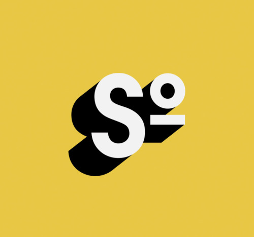
Using this idea of restricted opinions, i found this image on censorship:
Aside from its caption, I really like this image, as it portrays an idea that sometimes the fact that the subject has been censored/ punished for is more offensive than the actual material itself.
I found in this extract from the public and commercial services union website, that you can claim compensation of up to £50,000 for 'injury to feelings'. Could this be the reason people are so 'sensitive'?
Posters used to shun the use of free speech. They are almost warning in tone of voice and are stern in their message. I do not agree with this kind of attitude and want to use a less serious, more jovial tone in my own work, but want to still have a serious message.
This cartoon is depicting what can happen if you say too much. But, in my work I want to question what is 'too much'? I really like the execution of this as it needs no text to justify it's meaning in a lighthearted way.
I really like this design. I'm not sure of it's intended meaning but it could be used to show how freedom (of speech in this case) is limited. The dancer is not free to dance. Again, I think the most effective way of communicating my message would be without text.
Simple typography with an unrevealing title could intrigue the reader into looking/ reading further?
The use of the asterisk is a really simple tool- a symbol of political correctness?
I really love the symbolism in this piece, I think that using simple aesthetics would be the most effective way to communicate my message, with the support of a paragraph to inlcude details / actions for the reader to take. Perhaps a petition?
There is even a whole page on the guardian online about censorship and the constant, daily battles of offending others which could be challenged?
This article, found on Wikipedia, describes how the use of the term 'Christmas' is usually avoided in marketing in the United States for fear it will offend, even when referring to Christmas related items such as Christmas trees and Christmas holidays. Here is an extract from the article about seperate incidents regarding 'Christmas controversy'. 'A controversy regarding these issues arose in 2002, when the New York City public school system banned the display of Nativity scenes, but allowed the display of supposedly less overtly religious symbols such as Christmas trees, Hanukkah menorahs, and the Muslim star and crescent.[17] The school system successfully defended its policy in Skoros v. City of New York (2006).[18]In December 2007, a controversy arose[3] when a public school in Ottawa, Canada planned to have the children in its primary choir sing a version of the song "Silver Bells"
with the word "Christmas" replaced by "festive"; the concert also
included the songs Candles of Christmas and It's Christmas with the
original lyrics. Also, in 2011, in Embrun, Ontario, near Ottawa, one
school has barred the Christmas pageant and replaced it with a craft
sale and winter concert scheduled for February, 2012. (Ottawa Citizen,
December 2, 2011).'
Another article, found on the BBC News website, tells of how a nursery was accused of being over politically correct by changing 'baa baa black sheep' to 'baa baa rainbow sheep' because the original was 'racist'. This was in fact untrue and the nursery changed it for other reasons, where all the colours of the rainbow were mentioned so that the children could learn about colours. Could this be because that political correctness is now expected of the public? Does offence come from ourselves/ are we looking to be offended?
This article, found on the guardian online, shows one mans opinion on how Golliwog dolls are 'a vile throwback to a racist past'. While browsing through the comments section, about 10% agree with his statement, while the remaining 90% accuse him of being over sensitive over what they perceive to be nothing more than a Victorian doll. This hypersensitivity could be represented in bold imagery that makes the reader question why they are offended perhaps?
Politically Incorrect cartoons:
Steamboat Willie
There are lots of things that this original classic could be criticized for in politically correct terms. For example, the scene where Minnie doesn't get on the boat in time, and so Mickey lifts her up with a crane by her underwear to lift her aboard. Or when Mickey plays tunes on all of the animals on board, such as pulling the tails of the piglets/ strangling the goose...
But this is an old, trusted favourite. Why should this be banned/ censored? Although it is politically incorrect, in my opinion it is harmless.
Donald Duck: In der Fuhrers Face
However, there are lots of offensive materials that Disney has produced, such as this cartoon about Donald Duck. He has a nightmare that he is a Nazi under the order of Hitler and wakes up and is thankful that he is American and against the Nazis. This kind of propaganda is really risky in terms of keeping Disney neutral and clean of opinions. And yet, harmless cartoons/ imagery is seen as offensive, and this is left un-criticized?
Stereotyping:
This passage explains some of the types of stereotyping which others may find offensive. This could be turned into images- and indicate to the reader what they are about. The reader may be offended by this, but without text or abusive language or generalization, is it really offensive?
'Common Stereotypes
African Americans
One of the more
common stereotype examples is stereotypes surrounding African Americans.
Saying that all African Americans are good at sports is a stereotype,
because it’s grouping the race together to indicate that everyone of
that race is a good athlete. Another stereotype would be that all African Americans love to eat KFC, drink purple grape juice and eat watermelon.
Men and Women
There are also some common stereotypes of men and women, such as:
Men are strong and do all the work.
Men are the “backbone.”
Women aren't as smart as a man.
Women can’t do as good of a job as a man.
Girls are not good at sports.
Guys are messy and unclean.
Men who spend too much time on the computer or read are geeks.
Cultures
Stereotypes also exist about cultures an countries as a whole. Stereotype examples of this sort include the premises that:
All white Americans are obese, lazy, and dim-witted. Homer Simpson of the TV series The Simpsons is the personification of this stereotype.
Mexican stereotypes suggest that all Mexicans are lazy and came into America illegally.
All Arabs and Muslims are terrorists.
All people who live in England have bad teeth.
Italian or French people are the best lovers.
All African Americans outside of the United States are poor.
All Jews are greedy.
All Asians are good at math. All Asians like to eat rice and drive slow.
All Irish people are drunks and eat potatoes.
All Americans are generally considered to be friendly, generous, and tolerant, but also arrogant, impatient, and domineering.
Groups of Individuals
A
different type of stereotype also involves grouping of individuals.
Skaters, Goths, Gangsters, and Preps are a few examples. Most of this
stereotyping is taking place in schools. For example:
Goths wear black clothes, black makeup, are depressed and hated by society.
Punks wear mohawks, spikes, chains, are a menace to society and are always getting in trouble.
All politicians are philanders and think only of personal gain and benefit.
Girls are only concerned about physical appearance.
All blonds are unintelligent.
All librarians are women who are old, wear glasses, tie a high bun, and have a perpetual frown on their face.
All teenagers are rebels.
All children don't enjoy healthy food.
Only anorexic women can become models.'
JUST TO CLARIFY I DO NOT AGREE WITH STEREOTYPING, AND DO FIND IT OFFENSIVE. But does this not mean that being offended is self-induced?
After the group critical analysis today, there were 3 thoughts/ opinions/ suggestions given to me on my work that i would like to take action on:
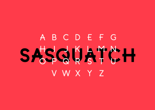
"'K' isn't working - why not use the right hand side of the x instead?"
"think about glyphs and how they would follow the style"
"the arm of your 'f' looks out of place"
My responses:
I agree with this, i was having difficulty following the same rule as the rest of the typeface for this part, and will try using the right half of the 'x' and see how it looks!
I am currently sketching glyphs and using the same oval shape as a guide to keep it consistent.
I also agree with this - i will try moving the arm down the spine so that it is in line with the arm of the 't'.
Brief
Design a typeface for a full alphabet and glyphs (a to z, !, ?, @. £. :, .) that represents the personality/ character of your partner. You will discover their personality/ character through a series of set questions. Using
your newfound appreciation of the anatomy of typographic forms and the
wealth of research that you have already gathered, focus on the
manipulation of existing in order to solve this problem. Background/ Considerations EXPERIMENT with a range of possible line qualities,
marks, colour and paper types. How will you colour help with the
communication? What paper stocks can you work with? Do you need to draw,
photocopy, photograph, collage, trace or combine all these processes? Your final resolutions should read as convincing, well crafted and clearly presented typographic forms. Mandatory Requirements
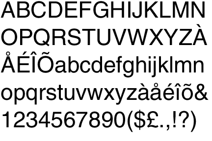
The typeface that you create must be based upon an exsisting typeface that you will manipulate, produce in only black ink. Type must be laid out in given format:
A B C D
E F G H
I J K L
M N O P
Q R S T
U V W X
Y Z ? !
, . @ "
Each resolved letterform should be
supported by a broad range of visual investigation in the form of design
sheets and notebooks. Deliverables
A1 poster (tracing paper) Name badge for your partner (45mm x 90mm) Progress Crit : 12th October 2012 Studio Deadline : 19th October 2012 Module Deadline : 23rd November 2012
My Partner : TRISTEN CURRIE
I asked Tristen a series of questions to get to know him better;
What is your favourite colour?
"don't really have one but if i had to pick i'd say.. green"
What is your earliest memory?
"probably falling out of bed when i was younger. I just remember waking up on the floor a few times"
Which living designer/ type of design do you most admire, and why?
"anything minimalistic and modern, i like design to be clean and set straight. I also like street art, particularly Banksy, because it's got intelligent meanings behind it"
What would your super power be?
"teleportation, so I could travel a lot. I love to travel, I'd hate to live in the same place for my whole life"
Which piece of graphic design do you wish you had created?
"nothing specific..."
Who would play you in a film of your life?
"Johnny Depp or Humphrey Bogart, they're both speak really classy which i like"
Who would you invite to your dream dinner party?
"Natalie Portman, Jimi Hendrix, Frankie Boyle"
We then decided to create spider diagrams of each other, to get more of an idea as to which direction to steer our designs towards. I mostly focused on his art interests, to get more visual ideas:
Examples of Jelle Martens work, one of Tristen's favoured designers:
The traits of Jelle Martens work is the diagonal, parallel lines with overlapping colours and sepia tones. The upward angles could somehow be incorporated into my letterforms?
And Sarah Morris :
The simple, segmented blocks of colour are the most prominent thing about Sarah Morris' work. The colours and composition is almost at random and disjointed. Can this be somehow incorporated into my work?
London Underground Map:
Again, the block colours and geometric, diagonal lines are big features in the London tube map design.
Helvetica:
Helvetica is a simple gothic typeface that is associated with clean cut design and lots of white space. Arguably, it works best in black and block colour (IE, filled in). This type of font would coodinate well with the other types of designs that Tristen has suggested, but is completely different in appearance. How am I going to combine the two styles?
Marius Roosendaal:
Again, very similar style to that of Jelle Martens in that it uses overlaying colours and fades with diagonal lines and geometric shapes.
andy gilmore:
Further examples of work provided by Tristen:
I really like the dramatic, unrealistic drop shadow on this typography, and would like to somehow incorporate it into my designs.
As a group, we gathered all our typeface research together to give inspiration for our own typefaces:
This really helped, as straight away i was thinking of ideas for my own typeface.
I started my personal research with the definition of my word: layer
and from this, came a flood of ideas:
My first ideas were all the obvious, literal meanings of the word 'layer' including layers of clothing, stratums, layered cakes and layering paper. I then thought a little harder and linked it to Graphic design through the layers of Photoshop. The cross section idea lead onto the MRI scans idea, which i think is visually really interesting and definitely one of the ideas i want to take forward. I also started to think laterally in that i thought of hens are layers of eggs and tilers are layers of tiles. The Ozone layer idea would be very subtle in outcome, to not be like the cross section ideas such as being an eco-friendly typeface in little use of ink.
-------------------------
A cross section of earth, revealing millions of years worth of layered rock. A pictorial version of this would be visually very attractive for an idea.
A more pictorial version of the layered surface of the earth.
The above pictures could be translated into a typeface in a geometric, 3D form such as this:
In my opinion, the really boxy isometric style would fit in well with the mock-scientific style of the stratum image.
-------------------------
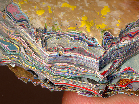
I also researched further into the layering of paper;
Handmade paper combined with layering can look beautiful and intricate but in my small timespan is not very practical!
The layers are really prominent in this really beautiful 'Paper Forest' by Helen Musslewhite. The use of lighting really helps in the exaggeration of layering.
I absolutely love this it is beautiful! but again, the intricacy to something similar to this would take weeks if not months to create.
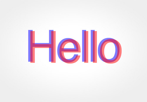
These layers of dried paint is visually very effective. A similar effect could be made using marbling ink on paper, perhaps? ------------------------- Another quite literal and visually obvious meaning to the word layer would be to show 3D text, as it requires two layers of both red and blue to have the 3D effect:
A deeper meaning to the word layer would be to feature MRI or CAT scans into the typography:
MRI and Cat scans show clear cross-sections, or 'layers' of the human head and/or body
A closer view at the side cross section of the head. because of the roundedness certain elements could be used as a G, O , Q, C or D.
Cross section through the top of the head. Shapes of letters such as U, G, O and maybe even J (?) could be made from this image. -------------------------
A more elaborate meaning to the word layers would be to describe the hierarchy system in an anthill:
They have layers of chambers where only ants of certain importance live upon:
Lots of interesting, psychedelic style lettering can be taken from the shapes just from this photograph. I can see a letter 'E', 'F' and 'G' just in the top left hand corner.
-------------------------
Flipcharts are a clear visual understanding of functioning layers of type/numbers:
-------------------------
Less obvious, more comical approach of the fried egg, as hens are usually referred to as 'layers' of eggs by farmers and other agricultural workers:
'O', ' G', 'Q', 'e' and 'C' are all letters resembling the shape.
-------------------------
Without trying to do the same sort of thing as the cross section of land as above, my ideas for the Ozone layer were a little less visually obvious. I researched into eco friendliness and greener ways of type design. I found that Century Gothic uses 30% less ink, meaning less paper too. What if i were to create a type that was even thinner, and lightweight?
Thin type examples found on fontspace:
-------------------------
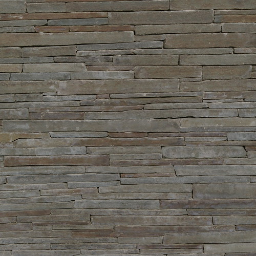
Another obvious idea, layers of bricks:
Maybe less conventional bricks, though?
-------------------------
The layers of hair would be visually attractive, and so i looked at photos of actual hair such as this:
And also looked at hair typography for inspiration. I love the fluidity and movement of this typeface:
A more rigid, cartoon-like approach:
A quiff or a curl can be used as the top of a 'G' like here, or the tail of a 'J', 'g', 'S', and 'Q' .
-------------------------
And finally, the layers of an onion!
the roundness of the outside of the onion and the straightness of the inside of the onion mean its a really flexible shape to create almost any letter (if not, all lower case letters).