Design a typeface for a full alphabet and glyphs (a to z, !, ?, @. £. :, .) that represents the personality/ character of your partner. You will discover their personality/ character through a series of set questions.
Using your newfound appreciation of the anatomy of typographic forms and the wealth of research that you have already gathered, focus on the manipulation of existing in order to solve this problem.
Background/ Considerations
EXPERIMENT with a range of possible line qualities, marks, colour and paper types. How will you colour help with the communication? What paper stocks can you work with? Do you need to draw, photocopy, photograph, collage, trace or combine all these processes?
Your final resolutions should read as convincing, well crafted and clearly presented typographic forms.
Mandatory Requirements
The typeface that you create must be based upon an exsisting typeface that you will manipulate, produce in only black ink. Type must be laid out in given format:
A B C D
E F G H
I J K L
M N O P
Q R S T
U V W X
Y Z ? !
, . @ "
Each resolved letterform should be supported by a broad range of visual investigation in the form of design sheets and notebooks.
Deliverables
A1 poster (tracing paper)
Name badge for your partner (45mm x 90mm)
Progress Crit : 12th October 2012
Studio Deadline : 19th October 2012
Module Deadline : 23rd November 2012
My Partner : TRISTEN CURRIE
I asked Tristen a series of questions to get to know him better;
What is your favourite colour?
"don't really have one but if i had to pick i'd say.. green"
What is your earliest memory?
"probably falling out of bed when i was younger. I just remember waking up on the floor a few times"
Which living designer/ type of design do you most admire, and why?
"anything minimalistic and modern, i like design to be clean and set straight. I also like street art, particularly Banksy, because it's got intelligent meanings behind it"
What would your super power be?
"teleportation, so I could travel a lot. I love to travel, I'd hate to live in the same place for my whole life"
Which piece of graphic design do you wish you had created?
"nothing specific..."
Who would play you in a film of your life?
"Johnny Depp or Humphrey Bogart, they're both speak really classy which i like"
Who would you invite to your dream dinner party?
"Natalie Portman, Jimi Hendrix, Frankie Boyle"
We then decided to create spider diagrams of each other, to get more of an idea as to which direction to steer our designs towards. I mostly focused on his art interests, to get more visual ideas:

Examples of Jelle Martens work, one of Tristen's favoured designers:


The traits of Jelle Martens work is the diagonal, parallel lines with overlapping colours and sepia tones. The upward angles could somehow be incorporated into my letterforms?
And Sarah Morris :


The simple, segmented blocks of colour are the most prominent thing about Sarah Morris' work. The colours and composition is almost at random and disjointed. Can this be somehow incorporated into my work?
London Underground Map:

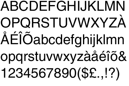
Helvetica:
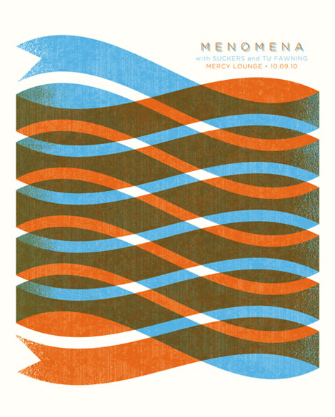
Marius Roosendaal:


Again, very similar style to that of Jelle Martens in that it uses overlaying colours and fades with diagonal lines and geometric shapes.
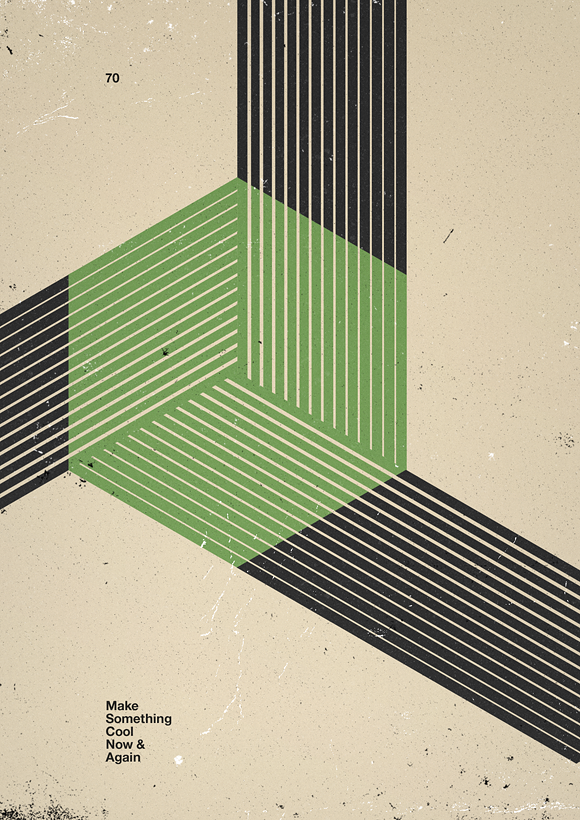
andy gilmore:
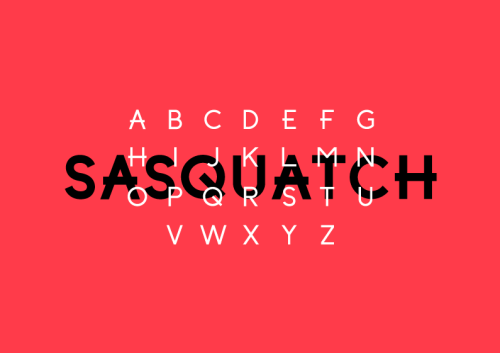
Further examples of work provided by Tristen:


 |
| I really like the dramatic, unrealistic drop shadow on this typography, and would like to somehow incorporate it into my designs. |
No comments:
Post a Comment