This really helped, as straight away i was thinking of ideas for my own typeface.
I started my personal research with the definition of my word: layer
and from this, came a flood of ideas:
My first ideas were all the obvious, literal meanings of the word 'layer' including layers of clothing, stratums, layered cakes and layering paper. I then thought a little harder and linked it to Graphic design through the layers of Photoshop. The cross section idea lead onto the MRI scans idea, which i think is visually really interesting and definitely one of the ideas i want to take forward. I also started to think laterally in that i thought of hens are layers of eggs and tilers are layers of tiles. The Ozone layer idea would be very subtle in outcome, to not be like the cross section ideas such as being an eco-friendly typeface in little use of ink.
-------------------------
 |
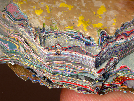
| A cross section of earth, revealing millions of years worth of layered rock. A pictorial version of this would be visually very attractive for an idea. |
 |
| A more pictorial version of the layered surface of the earth. |
 |
| In my opinion, the really boxy isometric style would fit in well with the mock-scientific style of the stratum image. |
-------------------------
I also researched further into the layering of paper;
 |
| Handmade paper combined with layering can look beautiful and intricate but in my small timespan is not very practical! |
 |
| The layers are really prominent in this really beautiful 'Paper Forest' by Helen Musslewhite. The use of lighting really helps in the exaggeration of layering. |
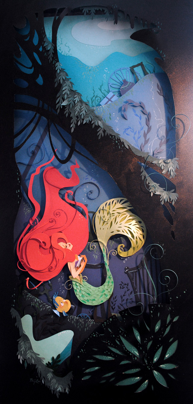 |
| I absolutely love this it is beautiful! but again, the intricacy to something similar to this would take weeks if not months to create. |
http://www.genetologisch-onderzoek.nl/index.php/category/geologie/stratigraphy/
A deeper meaning to the word layer would be to feature MRI or CAT scans into the typography:
 |
| MRI and Cat scans show clear cross-sections, or 'layers' of the human head and/or body |
 |
| A closer view at the side cross section of the head. because of the roundedness certain elements could be used as a G, O , Q, C or D. |
 |
| Cross section through the top of the head. Shapes of letters such as U, G, O and maybe even J (?) could be made from this image. ------------------------- |
A more elaborate meaning to the word layers would be to describe the hierarchy system in an anthill:
They have layers of chambers where only ants of certain importance live upon:
 |
| Lots of interesting, psychedelic style lettering can be taken from the shapes just from this photograph. I can see a letter 'E', 'F' and 'G' just in the top left hand corner. |
-------------------------
Flipcharts are a clear visual understanding of functioning layers of type/numbers:
-------------------------
Less obvious, more comical approach of the fried egg, as hens are usually referred to as 'layers' of eggs by farmers and other agricultural workers:
'O', ' G', 'Q', 'e' and 'C' are all letters resembling the shape.
-------------------------
Without trying to do the same sort of thing as the cross section of land as above, my ideas for the Ozone layer were a little less visually obvious. I researched into eco friendliness and greener ways of type design. I found that Century Gothic uses 30% less ink, meaning less paper too. What if i were to create a type that was even thinner, and lightweight?
Thin type examples found on fontspace:
-------------------------
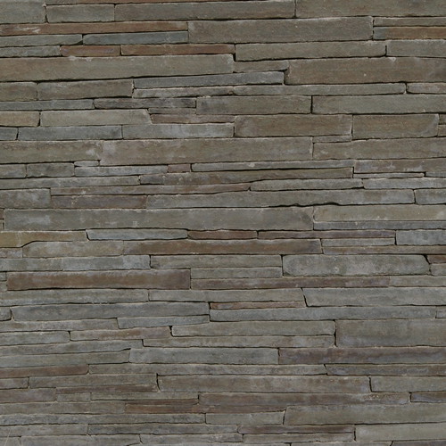
Another obvious idea, layers of bricks:
Maybe less conventional bricks, though?
-------------------------
The layers of hair would be visually attractive, and so i looked at photos of actual hair such as this:
And also looked at hair typography for inspiration. I love the fluidity and movement of this typeface:
A more rigid, cartoon-like approach:
A quiff or a curl can be used as the top of a 'G' like here, or the tail of a 'J', 'g', 'S', and 'Q' .
-------------------------
And finally, the layers of an onion!
the roundness of the outside of the onion and the straightness of the inside of the onion mean its a really flexible shape to create almost any letter (if not, all lower case letters).






No comments:
Post a Comment