Friday 26 October 2012

OUGD401 - Context of Practice - Session 1 - Critical Analysis

In todays context of practice session, we each gathered together our 4 examples of design we did and didn't like in groups and placed them in the middle of the table. We wrote on the back of each one whether we did or didn't like it and in groups, switched tables. 
We then had to sort out the other groups pile of examples into a like and dislike pile. 

We discovered that, quickly and subconsciously, we all used the same list for judging/ sorting work. Something along the lines of this:


  • Quality/ skills/ execution of design
  • Layout (concerning type)
  • Composition (overall)
  • Colours used
  • How effectively the design communicates
  • If the context is clear/ unclear
  • Concept
  • Legibility
  • Function
  • Suitability for audience
  • Content (non visual)
  • Content (visual)
  • Media and method of production
This list is essentially our usual criteria for analysing/ sorting work.

Critic, criticism, critical, criterion and critique come from the greek ; to judge, distinguish and/or select.

Is there a problem with us all using the same criteria? Does that mean that we cannot give constructive criticism on each others work, since we are all using the same judging techniques?
When the sorted piles of likes and dislikes were turned over we discovered that although we all have different taste, some of the groups sorting opinions were correct, and so exactly the same!

D.I.E.T. - an alternative criteria

D - describe (what can you see?)
I - interpret (what is it about?)
E - evaluate (how good is it?)
T - theorise (how could it be improved?)

We then got into partners and chose a piece of work to analyse each. We started by writing the description and our interpretation of our chosen piece. 

Here is what i wrote for my image, 'Rolling Along'

D - A logo including a cartoon/ microsoft clipart of a man on a unicycle incorporated into wordart text. There is an unusual, unrealistic drop shadow on the text only. A bright, fluorescent blue and green colour scheme. Arial font, blurry, pixelated aesthetics and old fashioned imagery.

I - I do not know what the company is/does from this logo- it is not entirely clear but the unicycle and the dashed lines behind it, accompanied with the wavy text suggest movement. The name of the company also suggests this. But this company could be anything from bike rental, to careers advice (rolling along.... progress....).

And what i wrote for Ellen's image, straightsmiles

D- blue and white colour scheme, stretched/ distorted text all in Comic Sans font in lip shape with gradient. not sure if logo or business card design.

I - From the text alone i know that it is representing an orthodontics centre, but if i could not read the text i would be able to know this because of the cold colour scheme (ie, mint toothpaste etc) and the lip shape in the background. Also, the way that the text is curved along the bottom of the lip is suggestive of a jawline.

We then swapped images and wrote the description and interpretation of that one too. We ensured that one could not see what the other was writing, so that we could compare what we had written - was a vaguer criteria the answer to independent answers?

There were more similarities than differences in our answers! 

We both identified the colour scheme in our description of Rolling Along and commented on the distortion/ manipulation of the text. We described the quality of the images more than the images themselves.
And for Straight Smiles, we could identify the company's purpose from their logo through the colour scheme and text. We both also had to comment on the font used!

We then, as a pair wrote the evaluation and the theory for the two images:

Rolling Along

E - Rolling along poorly communicates its message. The image is outdated in style and of  bad quality, ie blurriness and execution. The colour scheme is too bright, and also gives it an overall outdated feel. Old fashioned techniques have been used to create this and it is shown!

T - Redesign the whole logo! a different platform should be used to create the logo for starters such as Adobe Illustrator or Photoshop , not Microsoft clipart! A plainer, more contemporary typeface, even something like helvetica would be more effective. A different way incorporating the image should be used. A short company description should also be included, so that it is clearer what the company is all about.

Straight Smiles

E - Poor execution, again, using inappropriate programs and platforms. The distortion of the text is inconsistent and looks imbalanced because of this. Lip image in background is not quite symmetrical when it appears that it should be. Font doesn't relate to subject matter, and isn't professional. Although, the colour scheme is fresh and fits well.

T - Different typeface is needed - again, something contemporary and clinical. The lip image is a nice idea, but needs to be redrawn symmetrically and perhaps opacity to be reduced so its not too overfacing. The lip image should also be centred in the page, and the text at the bottom should be made smaller and across one line. 


What categories do our original criteria fall under in D.I.E.T. ? 

D - Colour, type selection, manipulation of type, layout, quality of image, line & stroke, texture, composition, theme, content, concept, structure. OBJECTIVE

I - message, clarity, function, context, audience, tone of voice. SUBJECTIVE

E - general aesthetics, how effectively it communicates, quality of design, quality of execution, fulfilment of purpose, clarity. SUBJECTIVE

T - dependant on image/ design. SUBJECTIVE

In summary, we found that the outcome of assessment is not only down to personal opinion, but whether what we are assessing is objective or subjective. We all have similar ideas of what is good or bad design perhaps because we all aspire to the same profession, but there are times where we disagree because of personal taste. 


"The critique is both a deadline and a marker of a perpetual beginning, a freeze frame moment in the context of a continuous studio practice. 
This favours process over product, the means over the end..."


STUDIO SESSION 1 - CRITICAL ANALYSIS

(to be continued)

OUGD401 - Context of Practice - Task 1 - Critical Analysis

Why is critical analysis an important part of education?


  1. Although we, as a class are all of different taste, we can all appreciate good and distinguish bad design. And so when we have a group critique you can trust that you are getting a good outside opinion of your work, where they can see weakness that perhaps you yourself cannot.
  2. Group critiques are especially useful because you can receive/ give collective descriptions and pure interpretations of your work en masse, and so receive feedback as to whether the message you are trying to deliver is apparent or not.
  3. It's important because you can make mistakes and learn from your student colleagues in a safe environment where the deadline is the only reason to panic, not money or clients.
  4. You can be introduced to new/ more suitable design styles that are suggested during group critiques.
  5. You can measure your own abilities next to your contemporaries. This can either have a positive effect on your self esteem or inspire/ aspire to change your work for the better.

Five criteria that effect the way I judge if I like/ dislike a piece of work:

  1. Quality - If the quality is pixelated, fuzzy or if an illustration is not particularly well executed I am not usually interested in the rest of the design.
  2. Colours - I am particularly drawn to creative use of colour, and the scheme doesn't have to be minimal. The more colour the better, as long as it is used tastefully.
  3. Function - Packaging that has boring graphics but is especially inventive/ unusual/ creative in it's net will spark my interest a lot more than normal packaging with great graphics on. 
  4. Composition - If the composition/ layout is cluttered or overcrowded I do not favour it, unless there is a clever composition of hierarchy to clarify it.
  5. Media and Method of Production - I particularly favour Graphic design that has been letter-pressed / wood-blocked / laser cut/ multi media because of my current intrigue in these methods.

Thursday 25 October 2012

OUGD403 - Message and Delivery - Research

Brief

Create a body of visual research in responses to a story, issue or theme found in the national press tomorrow, Tuesday 23rd October.

Background/ Considerations

The willingness and ability to formulate informed opinions about your subject matter is an essential skill for a graphic designer. 

In addition to being aware of events, concerns and the (un)popularly held opinions of the world around you, you also need to consider the tone of voice with which they are reported. It is important that you read the stories thoroughly and research issues that are raised fully committing yourself to a visual opinion.

You can be serious, humorous, questioning, bold or subtle.

Mandatory Requirements

The story, issue or theme must come from a newspaper published on Tuesday 23rd October.

Deliverables

A body of research into the story, issue or theme of your choice. 
A physical copy of the newspaper.

Studio Deadline: Friday 26th October

Module Deadline: 23rd November 2012


My Chosen article:


This article, found in 'i' is an informal report on an incident concerning a man commenting on his views about gay marriage via Facebook and having a 40% pay cut because of it.

The tone of voice in this article, although informative is quite chatty and tells the story from the viewpoint of the author. He thinks that punishment for what he considers to be free speech is not a 'reasonable use of police or legislative time' and that 'modest opinions alone are no warrant for a demotion'.

The daily mails' article on this is much more neutral in opinion but there is still an underlying voice against censorship and punishment on freedom of speech.

Using this idea of restricted opinions, i found this image on censorship:


Aside from its caption, I really like this image, as it portrays an idea that sometimes the fact that the subject has been censored/ punished for is more offensive than the actual material itself.

I found in this extract from the public and commercial services union website, that you can claim compensation of up to £50,000 for 'injury to feelings'. Could this be the reason people are so 'sensitive'? 

Posters used to shun the use of free speech. They are almost warning in tone of voice and are stern in their message. I do not agree with this kind of attitude and want to use a less serious, more jovial tone in my own work, but want to still have a serious message.


This cartoon is depicting what can happen if you say too much. But, in my work I want to question what is 'too much'? I really like the execution of this as it needs no text to justify it's meaning in a lighthearted way.

I really like this design. I'm not sure of it's intended meaning but it could be used to show how freedom (of speech in this case) is limited. The dancer is not free to dance. Again, I think the most effective way of communicating my message would be without text.


Simple typography with an unrevealing title could intrigue the reader into looking/ reading further?
The use of the asterisk is a really simple tool- a symbol of political correctness?


I really love the symbolism in this piece, I think that using simple aesthetics would be the most effective way to communicate my message, with the support of a paragraph to inlcude details / actions for the reader to take. Perhaps a petition?
  • There is even a whole page on the guardian online about censorship and the constant, daily battles of offending others which could be challenged?
 
  • This article, found on Wikipedia, describes how the use of the term 'Christmas' is usually avoided in marketing in the United States for fear it will offend, even when referring to Christmas related items such as Christmas trees and Christmas holidays. Here is an extract from the article about seperate incidents regarding 'Christmas controversy'. 'A controversy regarding these issues arose in 2002, when the New York City public school system banned the display of Nativity scenes, but allowed the display of supposedly less overtly religious symbols such as Christmas trees, Hanukkah menorahs, and the Muslim star and crescent.[17] The school system successfully defended its policy in Skoros v. City of New York (2006).[18]In December 2007, a controversy arose[3] when a public school in Ottawa, Canada planned to have the children in its primary choir sing a version of the song "Silver Bells" with the word "Christmas" replaced by "festive"; the concert also included the songs Candles of Christmas and It's Christmas with the original lyrics. Also, in 2011, in Embrun, Ontario, near Ottawa, one school has barred the Christmas pageant and replaced it with a craft sale and winter concert scheduled for February, 2012. (Ottawa Citizen, December 2, 2011).'
  • Another article, found on the BBC News website, tells of how a nursery was accused of being over politically correct by changing 'baa baa black sheep' to 'baa baa rainbow sheep' because the original was 'racist'. This was in fact untrue and the nursery changed it for other reasons, where all the colours of the rainbow were mentioned so that the children could learn about colours. Could this be because that political correctness is now expected of the public? Does offence come from ourselves/ are we looking to be offended?
  • This article, found on the guardian online, shows one mans opinion on how Golliwog dolls are 'a vile throwback to a racist past'. While browsing through the comments section, about 10% agree with his statement, while the remaining 90% accuse him of being over sensitive over what they perceive to be nothing more than a Victorian doll. This hypersensitivity could be represented in bold imagery that makes the reader question why they are offended perhaps?
 Politically Incorrect cartoons: 

Steamboat Willie


There are lots of things that this original classic could be criticized for in politically correct terms. For example, the scene where Minnie doesn't get on the boat in time, and so Mickey lifts her up with a crane by her underwear to lift her aboard. Or when Mickey plays tunes on all of the animals on board, such as pulling the tails of the piglets/ strangling the goose... 
But this is an old, trusted favourite. Why should this be banned/ censored? Although it is politically incorrect, in my opinion it is harmless.

Donald Duck: In der Fuhrers Face


However, there are lots of offensive materials that Disney has produced, such as this cartoon about Donald Duck. He has a nightmare that he is a Nazi under the order of Hitler and wakes up and is thankful that he is American and against the Nazis. This kind of propaganda is really risky in terms of keeping Disney neutral and clean of opinions. And yet, harmless cartoons/ imagery is seen as offensive, and this is left un-criticized?

Stereotyping:

This passage explains some of the types of stereotyping which others may find offensive. This could be turned into images- and indicate to the reader what they are about. The reader may be offended by this, but without text or abusive language or generalization, is it really offensive?

'Common Stereotypes

African Americans

One of the more common stereotype examples is stereotypes surrounding African Americans. Saying that all African Americans are good at sports is a stereotype, because it’s grouping the race together to indicate that everyone of that race is a good athlete. Another stereotype would be that all African Americans love to eat KFC, drink purple grape juice and eat watermelon.

Men and Women

There are also some common stereotypes of men and women, such as:
  • Men are strong and do all the work.
  • Men are the “backbone.”
  • Women aren't as smart as a man.
  • Women can’t do as good of a job as a man.
  • Girls are not good at sports.
  • Guys are messy and unclean.
  • Men who spend too much time on the computer or read are geeks.

Cultures

Stereotypes also exist about cultures an countries as a whole. Stereotype examples of this sort include the premises that:
  • All white Americans are obese, lazy, and dim-witted. Homer Simpson of the TV series The Simpsons is the personification of this stereotype. 
  • Mexican stereotypes suggest that all Mexicans are lazy and came into America illegally.
  • All Arabs and Muslims are terrorists.
  • All people who live in England have bad teeth.
  • Italian or French people are the best lovers.
  • All African Americans outside of the United States are poor.
  • All Jews are greedy.
  • All Asians are good at math. All Asians like to eat rice and drive slow.
  • All Irish people are drunks and eat potatoes.
  • All Americans are generally considered to be friendly, generous, and tolerant, but also arrogant, impatient, and domineering.

Groups of Individuals

A different type of stereotype also involves grouping of individuals. Skaters, Goths, Gangsters, and Preps are a few examples. Most of this stereotyping is taking place in schools. For example:
  • Goths wear black clothes, black makeup, are depressed and hated by society.
  • Punks wear mohawks, spikes, chains, are a menace to society and are always getting in trouble.
  • All politicians are philanders and think only of personal gain and benefit.
  • Girls are only concerned about physical appearance.
  • All blonds are unintelligent.
  • All librarians are women who are old, wear glasses, tie a high bun, and have a perpetual frown on their face.
  • All teenagers are rebels.
  • All children don't enjoy healthy food.
  • Only anorexic women can become models.'
 JUST TO CLARIFY I DO NOT AGREE WITH STEREOTYPING, AND DO FIND IT OFFENSIVE. But does this not mean that being offended is self-induced?


Wednesday 24 October 2012

OUGD401 - Graphic Design: a medium for the masses Lecture Notes

Graphic Design is a medium for the masses.

  • it had close relations to fine art and advertising
  • it can be used as a tool of capitalism/ politics
  • it works alongside social conscience.
 First signs of mark making that can be identified as a form of graphic design (ie communicating a message pictorally) are cave paintings in Lascaux, France created as early as 15,000-10,000 BC.


More examples can be found in the Arena chapel, Padua, Italy in Giotto Bondones 'Betrayal' which dates back to 1305.


A more identifiable example to modern day graphic design could be John Everett Millais painting, 'Bubbles' (1886) being used in a Pears Soap advert.


But the introduction of the term 'Graphic Design' was first used in 1922 in Herbert Spencer's 'Mechanised Art'.

The term 'visual communication' was first used by Max Bill and Josef Muller-Brockman.

Richard Hollis defined the term as we know it today when he said: 'Graphic Design is the business of making or choosing marks...'


Other early examples of Graphic Design as we know it today: 

  • Alphonse Mucha, 'Job', 1898 poster/ advertisement for cigarette papers.

  • Rennie Mackintosh 'Scottish Musical Review', 1896 poster/ advertisement for concert.

  • Koloman Moser, '13th session exhibition', 1902 poster/advertisement for exhibition.

  • Peter Behrens, 'AEG', 1910.

  • Savile Lumley, 'Daddy, what did YOU do in the great war?', 1915, propaganda poster for WW1.

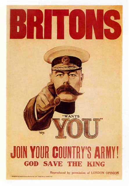
  • Alfred Leete, 'Your country needs you!', 1914, propaganda poster for WW1.

  • J.M. Flagg, 'I want YOU for U.S. army!', 1917, US propaganda poster for WW1 & 2.

  • Julius Gipkens, trophies of the air war.

  • Kankindsky, 'Composition VIII', 1923

  • 'Beat the Whites with the Red Wedge', 1919, poster.

  • F.H. Stingemore (UK), London Underground Map.

  • Harry C. Beck, London Underground Map, 1933.

  • Simon Patterson, 'The Great Bear', 1992. (variation of tube map)

  • Askar Schlemmer, 'Bauhaus logo', 1922.

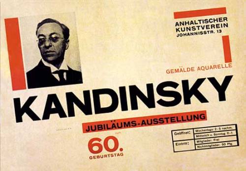
  • Herbert Bayer, ' Kandinskys 60th Birthday'


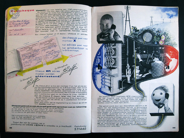
  • Piet Zwart, 'Het Boek PTT', 1938,  Dutch telephone service book    


  • Herbert Matter, 'Swiss tourist board' 1932-34, poster advertisements.

  •  A.M. Cassandre, L'intransigeant, 1925, Newspaper poster

  • A.M. Cassandre, 'Etoile du Norde', 1927 poster

  • Tom Purvis (UK), 'LNER' 1937, poster.


  • Ludwig Hohlwein, 'Reichs sports day for the association German girls', 1934, poster


  • Ludwig Vierthaler, 'Degenerate art', 1936, exhibition poster

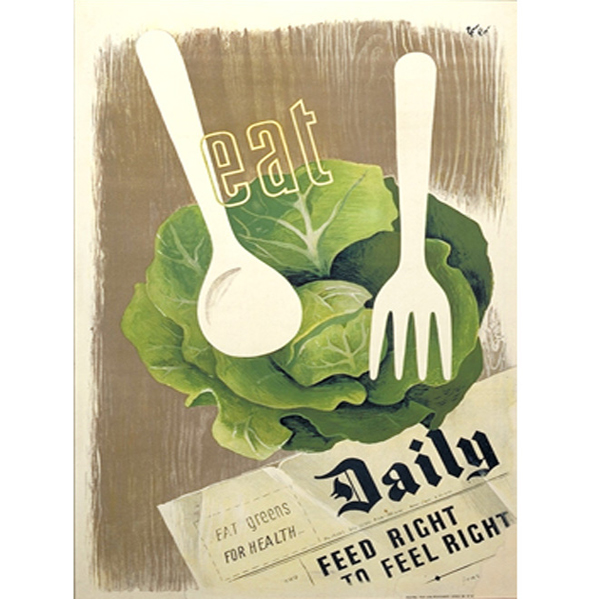
  • Hans Schleger (German living in UK), 'Eat greens for health', 1942, poster

  • Josef Renau, 'Industry for War', 1936 poster.

  • Josef Renau, 'Starlingrad: new star of freedom', 1942, poster.
  • Pere Catala i Pio, 'Lets squash fascism', 1936, poster.

  • V. Deni & N. Dolgorukov (Russian), 'Our Army and Our Country are strengthened with the Spirit of Stalin!', 1939, poster

  • Paul Rand, 'Jacqueline Cochran', 1946, poster/ advertisement.

  • Saul Bass, 'The man with the golden arm', 1955, poster/ advertisement for film.
  • Abram Games, Catalogue for exhibition of science, 1957, poster for festival of Britain.
  • Saul Bass, 'Vertigo', poster for film.
  • Paul Rand, 'Logo for ABC', 1962, logo.
  • Paul Rand, 'poster for IBM', 1964, poster/ advertisement.
  • Ken Garland, 'First things First Manifesto', 1964, essay.
  • FHK Henrion, 'Stop nuclear suicide', 1960, poster.
  • Seymour Chwast, 'End bad breath', 1968, propaganda poster.
  • Art workers coalition, 'Q. and babies? A. and babies.', 1970, poster.
  • Hipgnosis, '10cc; Deceptive bends', 1977, sleeve design.
  • Jamie Reid, 'Sex Pistols; Never mind the bollocks...', 1977, sleeve design.
  • Peter Saville,' the factory club night FAC001', poster.
  • Peter Saville, 'New Order, Blue Monday', 1983, sleeve design.
  • Neveille Brody, 'The Face', 1980s, magazine covers.
  • David Carson, 'Ray Gun'
  • David Carson, 'Don't mistake legibility for communication'
  • Peter Blake, 'Band Aid; Do they know its Christmas?', 1984, sleeve design.
  • Chumbawamba, 'Pictures of starving children will sell records', 1986.
  • Jonathon Banbrook, 'Bastard Typeface', 1990, typeface design.
  • Jonathon Banbrook, 'Olympukes' , 1990s, comical symbol designs.
  • Designers Republic, 'Pop will eat itself', 1994, sleeve design.
  • Julian House, 'Primal Scream'
  • Mark Farrow, 'Spiritualized; Ladies and Gentlemen we are floating through space', 1997, sleeve design with limited edition pill packet style packaging.
  • Naomi Klein, ' Truth in advertising' 2000, essay (looking closer 4)
  • Oliviero Toscani, 'United Colors of Benetton', 1990-92, Advertisements.
  • Judy Blame, 'Keep Britain tidy', 1992, t shirt design.
  • 'The Coup; Party Music', 2001, withdrawn CD cover.
Graphic Design was first taught as a disipline at the Bauhaus.

In summary, Graphic design is a relatively young disipline and the lines between Graphic Design and fine art, advertising etc are becoming increasingly blurred, and always have been. 
Although born out of capitalist/ consumerist interests it is also becoming increasingly concerned with social issues.


Tuesday 23 October 2012

OUGD401 - Contextual Studies - 10 examples of Post/Modernism

5 Modernist pieces of art/ design:


This poster falls successfully under the category of modernist because of its minimalistic themes and its 'function before form' design. Its no-nonsense layout is clear and straight forward. The left alignment of the text is also a giveaway of modernist style. 

This page from 'Neue Grafik' magazine is strong in modernist themes because of its experimental but again, minimalistic style. The small range of colours used and the black and white images are not fussily decorative but still explore this idea. Again, the use of sans serif typeface such as helvetica is classic in modernist pieces. 

The simple shapes of this armchair and limited colour scheme show a strong modernist vibe. This doesn't explore the idea of function before form very successfully though because the design of the chair stands out more than the fact that it is a chair, but is still minimalistic and non-florid in style. Its also unsuccessful in that it will outdate, but is still modernist because its the typical style of the modernist period. 
This building, although again, failing in the 'function before form' rule because of its decorative walls atop the roof, its plain, box-like shape and black and white colour scheme is timeless - it was built in 1931 and would still be welcome in 2012!


The London tube map is a perfect example of modernist design because it is totally unrealistic in terms of shapes and proportion, but is clear, legible and easy to use. The designer didn't care what it looked like, so long as it successfully assisted in travelling round London- which it arguably does. 

5 Postmodern pieces of art/ design:

This piece of art by Damien Hirst named 'For the love of God'  is perfectly postmodern in it's arguably 'glorifying of the tacky' style. 8,601 real diamonds were encrusted on the platinum- plated real human skull - not even by the artist but by Bentley and Skinner jewellers and wasn't even designed by the artist but by Jack du Rose. The piece was said to be sold for  around £50 million. This piece is successful in the postmodern style because of its controversial themes and shock tactics. The huge price tag for lack of labour by the actual artist is also common in postmodern pieces.


Tracy Emins 'my bed' was also a victim to over hyped publicity. She argues that it tells a story - but it sparked a lot of controversy because it is arguably just an unmade bed. Through her artwork she challenges taboo themes of love and sex which you wouldn't really get in modern art. It is very successful in post modernity because the story behind it is more prominent than the actual manufacturing of the piece.


Yoko Ono's performance art piece 'cut piece', from the sixties is strong in post modern themes because it is more about the meaning behind it rather than its manufacturing efforts or visual appeal. 

The controversial imagery and shock tactics in Gilbert and George's 'naked shit pictures' are truly postmodern.Much hype and controversy over the obvious exploitative-nature of these artworks  put Gilbert and George on the map.


Barbara Krugers 'You are not yourself' is very postmodern in that it is strongly portrays a message to the viewer and is almost a graphic design piece. The shattered text reflects the same style of the shattered glass as the viewer tries to extract tthe message behind it.