I first got the idea to research into yurts when I was watching Extreme Makeover Home edition, and the adopted children's home of Kazakhstan, home to the yurts, was incorporated into the design of the home.
None of the following words are mine, this is just raw information I have found the most useful when researching into my chosen subject on Yurts.
"The yurt - kiyz ui in Kazakh, yurta in Russian - is a movable collapsible dwelling consisting of a wooden framework covered over with felt. It has been used by nomads for centuries, its design remaining basically unchanged throughout that time. It is, however, more than only a dwelling, having associations in the Kazakh mind with powerfully appealing traditions from a distant past, the open spaces of the steppe and mountains, and a generous hospitality it is easy to link with such settings. Perhaps this is why on important social occasions associated either with celebration or mourning, the households concerned erect yurts as a gathering point for guests, even in city centre courtyards. Yurts are also used for regional and national festivals.
Part of the power of the yurt as a symbol may be traced in its etymology. The word ’yurt’ comes from the Turkic word meaning ’dwelling place’ in the sense of homeland. The Mongolian term, ’ger’, the Afghani ’kherga’ or ’jirga’ and the Pakistani ’gher’ all also mean yurt. So there is an intimate connection between the idea of homeland and a portable place to stay. The link between these two concepts has been lost in the Kazakh, Uighur and Kyrgyz languages: the Kazakh and Uighur for yurt is kiyiz uy, whose literal meaning is ’felt home’; the Kyrgyz term is boz uy, meaning ’grey house’.
The symbolism is open to what some might see as a kind of cheapening by its use in all sorts of context without any obvious direct connection with nomadic life or kazakhstani history or tradition. So, for example, one frequently comes across yurt-shaped restaurants and cafes - even bus-shelters - built of concrete and brick. The attentive foreign tourists will be amazed at how often the yurt motif crops up.
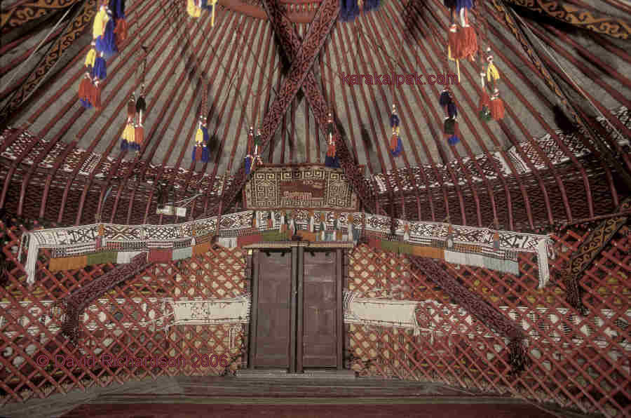
When the kerege is in position, the circular opening at the top of the yurt, the shanyrak, is lifted into place. The shanyrak not only provides ventilation and light; it also has an important symbolic function, associated with the fact that it is one of the most enduring parts of the yurt, needing replacement far more rarely than other components. Because of its longevity, it is frequently handed down from generation to generation. It has thus a deep significance to the household to which it belongs, representing the family’s past. Moreover the word shanyrak itself can mean more than this particular part of a yurt: in some contexts it can be translated as ’hearth’ or ’home’. The richness of the shanyrak as a symbol explains its presence on emblems of the Republic of Kazakhstan.
The sykyrlauyk is the entrance. The literal translation of the word is ’squeaky’, the connection presumably being with the noise made when the double doors, usually of richly carved pine or birch are opened or shut. The bosaga, or threshold, has great cultural importance and should not be stepped upon.
Inside, yurts are richly decorated with carpets - tekemet - on the floor and embroidery and braiding elsewhere. The yurt’s floorspace is divided up into functionally distinct areas: there are men’s and women’s sections, a work area, a cooking space, a children’s area, even a special part reserved for the married son and his wife. The part nearest the stove or hearth is kept for the most honoured visitors."
http://www.discovery-kazakhstan.com/archive/2008/10_7.php
Turkic Yurt Consists of a light bentwood crown, supported by
roof poles that are bent at one end to meet the
top of the wall trellis that also incorporates a
curve. This design gives a light, open portable
dwelling. Many people will tell you that this style
does without the use of crown supports as used
in a Mongolian type yurt. However we have seen
plenty of Kazakh's support the crown wheel with
various types of po;les once the wind gets up.
Yurt is traditionally covered with various layers of
felt., the outermost of which wouldbe ornately
embroidered. Door would consist of either a tall
double opening wooden door or a flap of felt. The
profile of a Turkic yurt is very distinctive and quite
different from a Mongolian yurt. These yurt are not
designed to be water resistant and hence fair
poorly when imported into the West, although
their basic design is the one most often copied
by UK yurt makers.

from yurtsdirect.com
The Karakalpaks (also Qaraqalpaqs) are a Turkic people. They mainly live in the lower reaches of the Amu Darya and in the (former) delta of Amu Darya on the southern shore of the Aral Sea in Uzbekistan. The name "Karakalpak" comes from two words: "qara" meaning black, and "qalpaq" meaning hat. The Karakalpaks number nearly 520,000 worldwide, out of which about 400,000 live in the Republic of Karakalpakstan.
The Karakalpaks inherited the yurt from their Turkic ancestors – the essential characteristics of the collapsible trellis-walled felt yurt had already been fully developed before the Karakalpak confederation of tribes emerged in the 15th or 16th centuries somewhere in the vicinity of the lower Syr Darya.
The yurt has remained the predominant dwelling for the Karakalpak family up until the early part of the Soviet era. A multitude of different crafts and skills were required to make its various component parts. Not surprisingly it has become the centre piece of a whole branch of Karakalpak culture and folk lore.
The yurt has many qualities: portable yet robust; quick to erect and dismantle yet stable and secure; warm in the bitter winters yet cool in the baking summers; affordable for a livestock-breeder yet capable of being used by a Khan. Of course the design of the Turkic yurt has evolved through a process akin to natural selection over almost one and a half thousand years. Each tribal confederation developed its own style of yurt with its own unique features, so although Karakalpaks lived besides Uzbeks, Qazaqs, and Turkmen in the Aral Delta, their individual yurts were immediately discernable.
Yurts are normally associated with nomadic pastoral societies, so it is important that we remember that the Karakalpaks were not nomads. They were traditionally “semi-settled”, meaning that each clan would have a wintering ground, qıslaw, and a summering ground, jazlaw, the two usually not too far apart from each other.
In the winter the yurts would be erected inside a windbreak fence for protection, and another fenced enclosure or qora would be built for the cattle. In the spring they would move their yurts to the summering ground, close to the cultivated areas, allowing their herds to graze on the surrounding pastureland and marshes. Working bullocks would be used to till the land. The awıls of individual clans were often located close to a water channel to which the members of that clan had hereditary rights. In the winter they relied on their agricultural by-products for forage: hay, wheat and millet straw, ju'weri stems (sorghum), and cane. In the autumn the fodder would be harvested and moved to the wintering ground by bullock cart or arba. In the marshy areas, especially in the north of the delta, this fodder would be supplemented by harvesting the local rushes.
In the winter the yurts would be erected inside a windbreak fence for protection, and another fenced enclosure or qora would be built for the cattle. In the spring they would move their yurts to the summering ground, close to the cultivated areas, allowing their herds to graze on the surrounding pastureland and marshes. Working bullocks would be used to till the land. The awıls of individual clans were often located close to a water channel to which the members of that clan had hereditary rights. In the winter they relied on their agricultural by-products for forage: hay, wheat and millet straw, ju'weri stems (sorghum), and cane. In the autumn the fodder would be harvested and moved to the wintering ground by bullock cart or arba. In the marshy areas, especially in the north of the delta, this fodder would be supplemented by harvesting the local rushes.
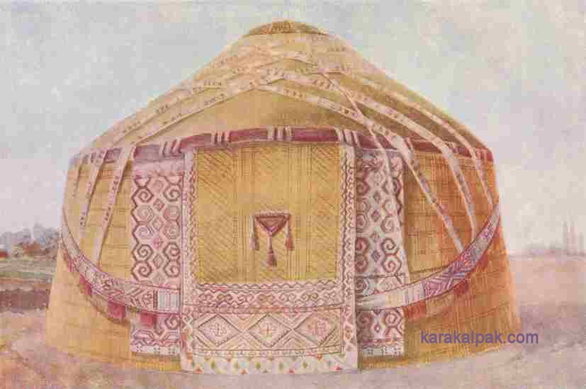
An idealistic image of the Karakalpak yurt.
Courtesy of the Khorezm Archaeological and Ethnographic Expedition, Moscow.
Special Features of the Karakalpak Yurt
The Karakalpak yurt is similar to the Turkmen, Uzbek, Qazaq, and Kyrgyz yurt, but does have some unique features, such as a distinctive shan'araq, or roof wheel.From a distance Karakalpak yurts have a characteristic cone-shaped roof, whereas the roof of the Qazaq or Turkmen yurt is traditionally dome-shaped. Having said this, modern Qazaq yurts made in Karakalpakstan are now also cone-shaped. In the 19th century some Qazaqs used animal skins rather than felts to cover their yurt roof.
However the yurts of the Khorezmian Uzbeks and the southern Kyrgyz also had a conical roof, the uwıqs having a single bend about 45cm from the end, just like the Karakalpak. Of course Kyrgyz yurts were never seen in the Aral Delta, but Uzbek yurts were quite common in the 19th century, especially on the l teft bank of the Amu Darya.
The main difference between the Karakalpak and the Uzbek yurt lies in the kerege trellis wall: Uzbek qanats were made from thicker and rounder poles and had much smaller lattice openings (ko'z). Zadykhina reported that an Uzbek yurt could weigh three times as much as a Karakalpak or Qazaq yurt, the reason being that the Uzbeks were settled so their yurts were never moved. In the winter, even though the felts and shiy screens were removed, the frames were often left in situ. Another obvious difference between Karakalpak, Qazaq, and Uzbek yurts is that the frames of the latter were never stained red.
When properly decorated, the Karakalpak yurt can be immediately identified from the white tent bands criss-crossing the roof, the shiy screen walls, the jolly pink and brown janbawsuspended like a garland on either side of the door, and the bold ram’s horn motifs on the weavings flanking each side of the door.
Types of Karakalpak Yurt
The normal yurt is called a qara u'y, meaning black home or dwelling, so called because over time the covering felts become darkened. This was especially so in the old days when every yurt had a hearth. Some well-to-do families erected two yurts: one, the qara u'y, was used as the living quarters for the elderly relatives and children; the other, the otaw(sometimes transliterated as otau or otav), was used for leisure and for receiving guests.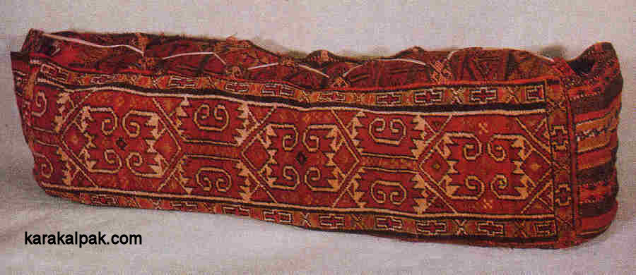
A Qazaq ten-tyuk from the Qizil Orda region of the lower Syr Darya.
Similar bags were woven by Qazaqs in the Aral Delta.
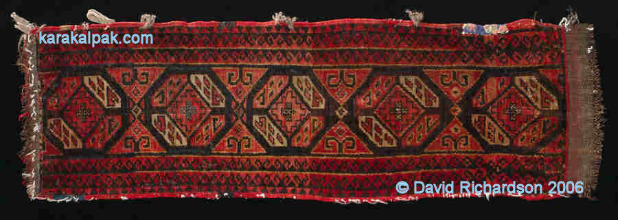
A complete qarshın storage bag from Bozataw.
The Richardson Collection.
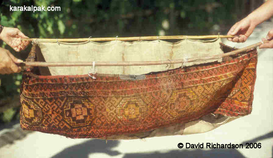
Today it is quite unusual to see a complete bag. Usually they have deteriorated into such a bad condition that the back, sides, and bottom have been removed, leaving just the decorative all-pile face – the qarshın aldı.
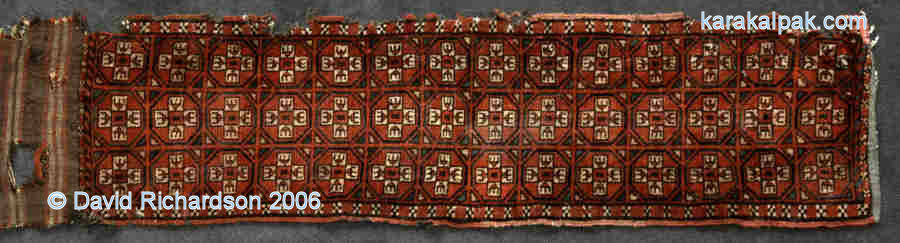
Qarshın Types
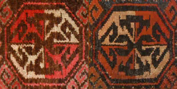
There are just four main types of Karakalpak qarshın, each with its own distinct pattern or decoration (nag'ıs). In addition there are a few rare patterns, some of which may have become extinct during the first quarter of the 20th century. Each type is quite different, bearing no resemblance to the others apart from the fact that all but one of them has a primary motif which is octagonal. Igor Savitsky was the first to realize that qarshıns generally incorporated an octagonal nag'ıs. The one exception is the Shu'yit qarshın, which incorporates a 24-sided chuval-like motif.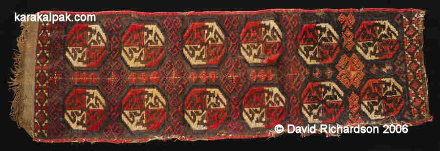
A tay tuyaq qarshın from Sverdlova sovxoz in Qon'ırat region.
Item number 4410 from the Savitsky State Museum of Art, No'kis.
Two different tay tuyaq motifs with opposite diagonal colour arrangements.
The second variant of the qarshın nag'ıs pattern has pairs of triangles separating the octagonal motifs.
A tikesh nag'ıs qarshın from Kegeyli. The Richardson Collection.
A typical Karakalpak esikqas sits above the door of a simple yurt at Sarı Altın in 2007.
A pair of decorative ishki janbaw are suspended from either side. The yurt has a structural ishki beldew
waist belt but no aq basqur. A qızıl qur links the shan'araq to the lattice walls.
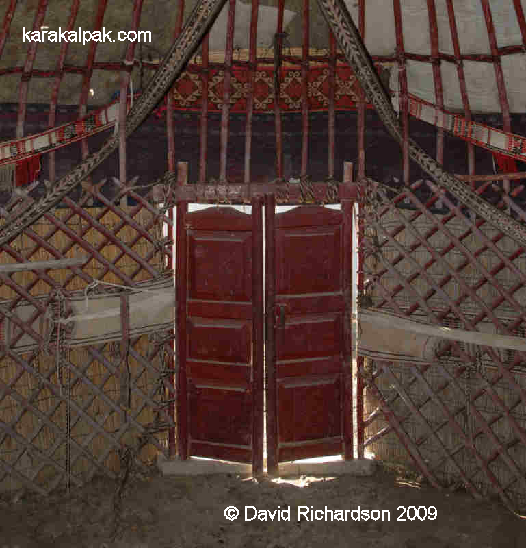
The interior of the yurt of a wealthy ex-Communist in Xalqabad. Despite his wealth the owner
did not have a traditional esikqas to decorate the door.

A wonderful shaxmax-patterned esikqas with a lower decorative fringe and tassels.
From the State Museum of Art named after Savitsky, inventory number 4886.

The Yurt Roof
The roof of the yurt is formed by long poles, known as uwıqs, attached to the keregebas and the central roof wheel or shan'araq. The uwıqs are round in section and generally undecorated (unlike Qazaq uwıqs). The uwıqs are bent part of the way along their length, leaving one long straight end and one short straight end. The bend is known as the iyineu (from iyin, shoulder). It is this single short bend which gives the Karakalpak yurt its distinctive conical shape.A hole is drilled near the bottom end of each uwıq and this has a cord attached to it by means of which it is fastened to the keregebas. This cord is known as the uwıqbaw and is made of black goat’s hair and white sheep’s wool twisted together like a barber’s pole. The top end of the uwıq is sharpened and is known as the qa'lemshe (literally pencil).

The roof wheel or shan'araq of the Karakalpak yurt is much more solid than that used in the Turkmen or Qazaq yurt. It has two rims, an inner one and an outer. The outer rim has holes through it, known as ko'z, into which the uwıq are inserted. The convex top of the sha'naraq is formed by a set of thin laths which are splayed at the ends like a Maltese cross. These fan-shaped laths are known as thebo'genek. Arrow-shaped pieces of wood protrude from the rim of the shan'araq towards the centre. They are placed in groups of three in the centre of each quadrant and are known as gu'ldirewish. These combined with the double-rimmed shan'araq unmistakeably identify the Karakalpak yurt.
The shan'araq is often lifted into position using a long post with a fork at its upper end. This post is known as a baqan and it is also used for placing the felts on the roof. Sometimes four uwıqs are tied together with a dizbe to make a temporary equivalent.
More dizbe are used to uniformly separate the uwıqs and to strengthen the structure. As this is done the uwıqs start to shift about and need a lot of adjustment. The uwıqs have a natural tendency to fall sideways, which would result in the spiral collapse of the roof if left unchecked. By tightly linking the uwıqs at the maximum point of their bend, these dizbe play a vital role in stabilizing the yurt roof.

Yurt images


National Geographic Educational Online
This makes sense, as more than three-quarters of the population of Mongolia live in gers today.
mongolian-yurt.com
he first written description of a yurt used as a dwelling was recorded by Herodotus of Halicarnassus, who lived in Greece between 484 and 424 BC.
This south-facing orientation is still prevalent today, there being obvious advantages to this for people living well north of the Equator.
As nomadic herders move at least three or four times a year in the search for good grazing lands, this feature is of essential importance. During times of war, ancient nomadic warriors were constantly on the move and the portability of yurts provided them with an opportunity to carry their homes with them wherever they went.
Wind resistance: The highlands and open plains of Mongolia are quite windy. On the open steppes and in desert regions, the wind can be strong enough to knock over any other type of portable dwelling. The circular shape of the yurt and the secure manner in which the outer covering is attached deflect these winds and do not affect the yurt’s stability, regardless of the direction from which the wind originates.
http://www.panoramicjourneys.com/wp/index.php/10-interesting-facts-about-the-mongolian-ger/
It is customary to move “sunwise,” that is in a clockwise direction inside the ger. It is also polite to leave a ger by backing out of it.
The west side is the male side, where the men sit and where their tools, saddles, and hunting kit are stored. The east is the female side, where the women sit and where their cooking utensils are kept.
American Yurts
http://www.mnn.com/earth-matters/wilderness-resources/blogs/yurts-everything-you-ever-wanted-to-know-but-were-afraid-to