The Media and the Gaze
From what we learnt in the previous lecture we can see there is a very strong consistency in visual language that women have been represented in a certain way in our culture and always have been.
Women are displayed in our culture in a way that sexualises / objectifies them, and unfortunately normalises this.
In terms of objectification, women are considered the sex to be viewed, and men are considered the sex that act/ provide / do.
This idea is derived from, and has survived since the male economic dominance historically. Men being the producers of visual culture historically, and the audience of which they are providing for being predominantly male also, we see an emergence of a male biased ideology of the female form.
This doesn't mean that women were not talented or skilled as artists but were simply socially excluded, historically.
'Birth of Venus' - An arty, classical depiction of a goddess which isn't feasible and unrealistic is therefore not offensive in this sense.
And yet 'Olympia' was viewed as offensive and taboo, although if anything the nudity is more modest. This is because the woman in the image doesn't invite you to view her but meets your gaze with challenging eyes. She is relaxed, unfazed, but not in the way that she is sexually comfortable around you, but in the sense that she is used to the situation - she is a prostitute. This less dreamy, more feasible sense of reality is thought to have made this feel more offensive than that of Venus.
According to art historians, to be naked is to be without clothes and to be nude is an art form. John Berger would disagree with this and says that to be naked is to be yourself but to be a nude is to be exposed and objectified by other's gaze.
Showing posts with label seminar. Show all posts
Showing posts with label seminar. Show all posts
Monday, 4 November 2013
Monday, 28 October 2013
OUGD501 - CoP Identity Seminar
Context of Practice Identity Seminar
Essentialism
Essentialism has a tendency to identify people's identities, IE your personality is born into you.
Identity and 'the other' in visual representation
Identity Creation - What makes you, you?
How do you express your identity?
Circuit of culture
Identity formation by Jaques Lacan
Jaques Lacan's theory of the 'Hommelette' implies that you are born a selfless, unaware being. You are an extension of your parents and are a clumsy non-being. It's not until the 'mirror stage' (not to be necessarily taken literally) where you see yourself being a separate thing from your parents that you take yourself more seriously and start having opinions and interests. But this is when the start of the conflict between who we are and who we want to be begins.
It's at this moment where you get an illusion of wholeness - where you recognise all your achievements and are content and pleased that you are in fact, a whole being. In his theory, it's this feeling we then try to achieve again our whole lives by receiving views from others. Our own subjectivity is fragile.
The problem with this is that this state relies on the assumption of opposition and radical otherness. In the same way we assure ourselves that our individuality is confirmed by other people's unity.
This however does shore up unstable identities through the illusion of unity - a good example of this is football hooliganism. The idea that the other team is rubbish assures them that their team is better than the actual fact that their team is successful in their own right.
This goes for anything such as belief systems, values, fashion and trends.
Study task 3 that follows from this session is here.
Essentialism
Essentialism has a tendency to identify people's identities, IE your personality is born into you.
Identity and 'the other' in visual representation
- The creation of identities
- The concepts of otherness
Identity Creation - What makes you, you?
- Skills
- Sense of humour
- Interests
- Clothes
- Education
- Fears
- Occupation
- Where you live and your accent
- Size
- Social Network used
- Gender
- Social skills
- DNA
- Religion and beliefs
- Sexual orientation
- Physical attributes
How do you express your identity?
- Tattoos and piercings
- Cosmetics - makeup, hair dye etc
- Liberation of sexuality
- Clothes
- Creative skills
- Where you CHOOSE to live
- Eating habits - (vegetarian/ vegan etc)
- Recreation
- Lifestyle choices - going to the gym, recreational activities etc
- Objects owned
Circuit of culture
Identity formation by Jaques Lacan
Jaques Lacan's theory of the 'Hommelette' implies that you are born a selfless, unaware being. You are an extension of your parents and are a clumsy non-being. It's not until the 'mirror stage' (not to be necessarily taken literally) where you see yourself being a separate thing from your parents that you take yourself more seriously and start having opinions and interests. But this is when the start of the conflict between who we are and who we want to be begins.
It's at this moment where you get an illusion of wholeness - where you recognise all your achievements and are content and pleased that you are in fact, a whole being. In his theory, it's this feeling we then try to achieve again our whole lives by receiving views from others. Our own subjectivity is fragile.
The problem with this is that this state relies on the assumption of opposition and radical otherness. In the same way we assure ourselves that our individuality is confirmed by other people's unity.
This however does shore up unstable identities through the illusion of unity - a good example of this is football hooliganism. The idea that the other team is rubbish assures them that their team is better than the actual fact that their team is successful in their own right.
This goes for anything such as belief systems, values, fashion and trends.
Study task 3 that follows from this session is here.
Tuesday, 4 December 2012
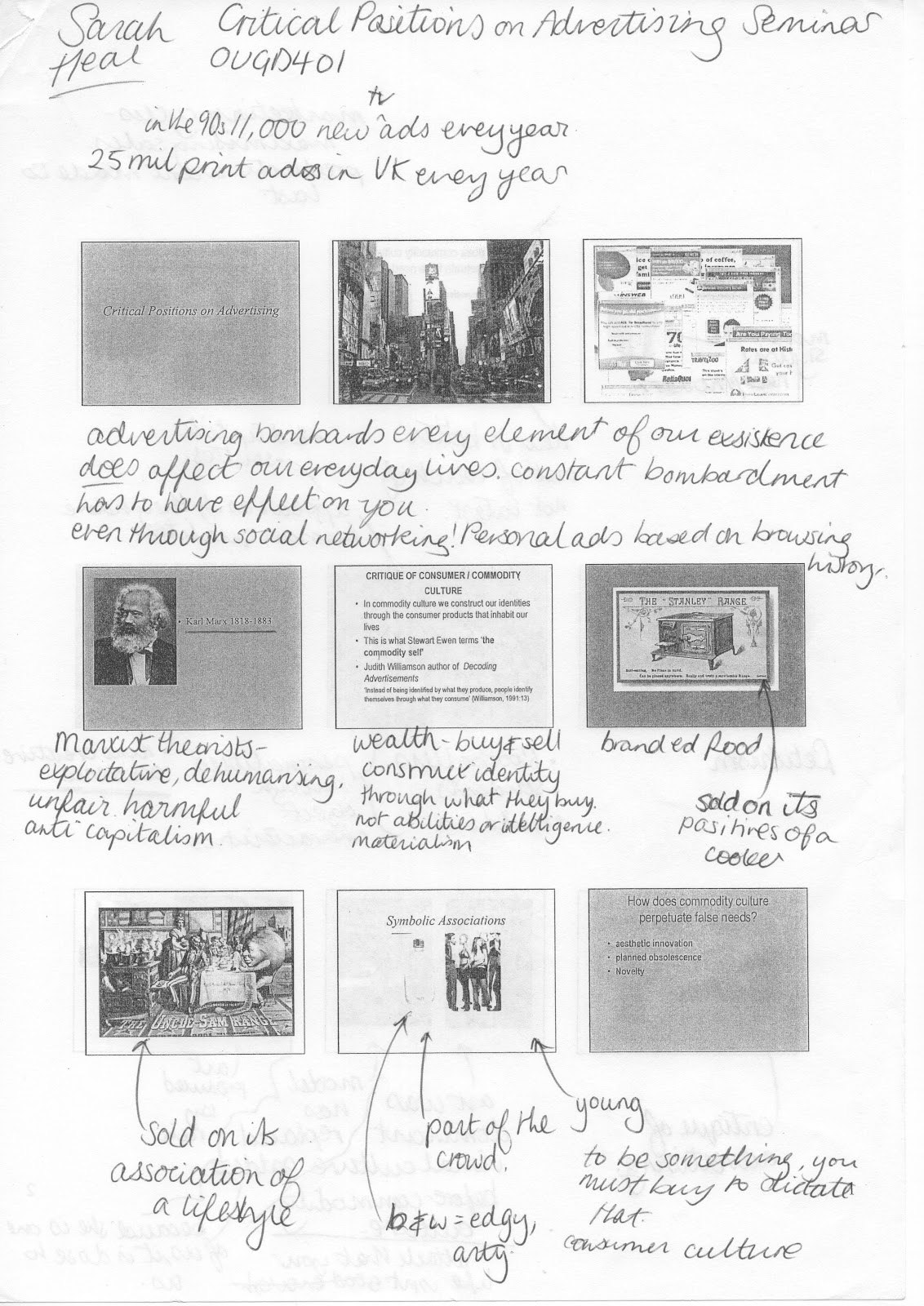
OUGD401 - Art, Graphic Design & 'Value' Seminar
Art, Graphic Design & 'Value' Seminar
Q - What do you think are the main differences between fine art and graphic design? Answer in your own words.
A - Graphic design solves problems of communication and has a broad, general, public audience, more so than fine art. Fine art isn't as structured or pushed for time and maybe is more expressive because of this. If graphic design doesn't make sense, it is unsuccessful whereas if fine art doesn't make sense, it only provokes more intrigue. Fine art is static and easily dated whereas graphic design (most of the time) is timeless.
General statements from collaborated answers from the class;
"Perhaps fine art is still ghost of elitist and high culture"
"Graphic design is made by the people for the people"
Arisman, M. (2003): 'Is there fine art to illustration?'
- Fine art is pure
- Illustration is the beginning of selling art
- Graphic Design is commercial art
- Advertising is selling - period.
Art vs. Graphic Design - some examples to think about and provoke discussion
- ambiguity or complexity of meaning
- the designer as wage labourer
- cultural significance
- expression and individuality
- creativity/ problem solving
- function
Ambiguity or complexity of meaning;
Fine art
- Sigmar Polke (1969)
- Monet (1882)
Graphic Design
- David Carson
- Allen Hori (1989)
The designer as wage labourer;
Some pieces in fine art such as 'For the love of God' by Damien Hirst are made by paid craftsmen and other specialists under the management of the artist.
Cultural Significance;
Constable (1821) The Haywain - in this image, there was workers revolt and the happiness of workers in the image isn't true!
Monetary Value;
Van Gogh - Sunflowers (1888) was sold in 1987 in Christies, London to Yasuo Goto, Yasuda Comp.
Picasso - Les nocos de Pierrette (1905) was sold in 1989, Binoche et Godeau, Paris Tomonori.
Expression and Individuality;
Jackson Pollocks piece from 1947
Tuesday, 23 October 2012
OUGD401 - Graphic Design and Modernism Seminar
'Graphic Design & Modernism' seminar
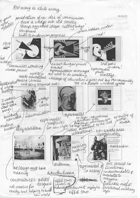
Modern, Modernity and Modernism saw a shift, a revolution in the new world embracing industrialisation and innovation in the everyday at a rapid rate. Modernity at it's birth was celebratory of it's utopian world surrounding it. Modern art became an almost socialist project in that art became for everyone, everyday. It gave everyone an equal access to culture, and therefore bore a simple language that everyone could understand, which was welcomed by the new internationalised world.
Postmodern, Postmodernity and Postmodernism saw an uproar of negativity, rivalism and a multiplex of ideas and opinions. Art for only those who 'get it'. A celebration of the everyday, but in a sinister, scarcastic manner: 'Crap is good'.
Modernism in Graphic Design
- rejection of ornament. (Adolf Loos, 1908 Ornament and crime)
- form follows function. (Louis Sullivan, 1896, 'the tall office building artistically considered')
- Communication should be prioritised, not aesthetics.
'Good Graphic Design should be invisible'
In 1927, a sort of rule book for Modernism was released. It stated that;
- No fonts are to be used except for Grotesk
- It is nationalistic
- Not historic , not looking backwards moving forward.
While at the same time, the overpowering force of Nazi Germany was anti modernist, celebrating fonts such as Fraktur.
Postmodernism in Graphic Design
- Function follows form.
- Message doesn't necessarily have to be communicated through words, if at all.
Artists such as Cheret and Toulouse-Lautrec starting experimenting with modern / postmodern attitudes as early as 1884. They played with type with a tendency towards the abstract. They innovated with manufacturing techniques.
Futurism
The Futurist manifesto is a strange response to that of Modernism. It is industrial and innovative yet self destructive. It celebrates war and the good that can come out of it, almost obsessively.
'Parole in Liberta' is a 1914 poem about the 1912 war. This poem is drastically visually different to the design that had gone before, and illustrates the feel of the poem visually not just through the words. The type used is sans serif and typical of the futurists' design. The poem is also onomatopoeic, which also reflects its experimental nature.
A new Modernist international Graphic style:
- Originating in post WWII Switzerland
- fundamentally neutral design, that can be globally understood
- no hand drawn images, only photography - a showcase of modern practice
- consisting of a controlled grid for design layouts
- the reduction of individually, and a 'one size fits all' attitude
Helvetica - the roman name for 'Switzerland'
Neue Grafik
A quintessential modernist graphic design magazine. It was universal, 'a publication for the whole world' in that it read in 3 languages throughout. It consisted of left aligned, sans-serif type with no images and functional hierarchy. There is no fussy composition - no confusion, just simple logical order.
Massimo Vignelli's 1972 subway map
Massimo Vignelli speaking in the film Helvetica:
- 'Modernism will never fade' - because it is for everyone.
- 'Postmodernists are a wasted generation'
- Graphics should be based on logic and not emotion.
David Carson also speaking in the film Helvetica:
- Graphic design is more about style, not communication.
- Being open to an an accident might turn out to be your best work
- Only a few things you can do with Helvetica. I don't love it & I don't hate it.
Tuesday, 16 October 2012
Wednesday, 10 October 2012
Tuesday, 9 October 2012
Subscribe to:
Posts (Atom)


