Further research - Pop up designs.
This video is really helpful because it shows the process of creating mass pop up books for commercial purposes. The process is really long and thorough - will I have enough time to execute something similar?
This video emphasises the plural workforce it takes to execute a pop up book. Again, it says that the time scale is 18 months... I will really have to refine my ideas and produce lots of test pieces to speed up the design process.
A few really nice ideas in this book - how can I apply these techniques? I really like the use of acetate also in these designs.
The full process to produce just one page of a pop up book. Perhaps I could reduce the design process time by creating just a couple of feature pop up pages and the rest lift-the-flap?
Research for graphics of book:
Research for graphics of book:
 |
| This type of cartoon style will appeal to children and the colours are really interesting and suprisingly bright. |
fabienbarral2.jpg) |
| This is a really nice example of a western version of a buddhist style. It is really modern, and I really like the way the font is modern, yet whimsical and curved. |
 |
| I really like this particular detail because it is truly beautiful! I want to somehow incorporate this into my cartoon style book. |
 |
| This simple drawing of a lotus flower is slightly stylised but not |
 |
| The wheel of Dharma will be a nice feature to include in the book, and this one in particular is interesting to look at. |
These images will help me portray an overall eastern feel. I particularly like the cloud images and the lotus flowers.
the palace page
the middle way page
 |
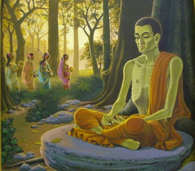
| I really like this artwork because it it extremely oriental and so true to Buddhist style. I really like the use of gradient lighting, something I want to use in my book. |
 |
| I need to show this image in a non-gruesome way but still need to show that the Buddha was really hungry. Maybe make him a little thinner and slight shadowing on his chest? |
| This image is good because it roughly shows the foliage and shrubbery that would have been in the forest with the buddha. |
finding enlightenment page:
I looked at these three images for inspiration into the layout of the page, which resulted in the Buddha being in the centre of the image, with the Bodhi tree filling the page in a symmetrical way. The top image of the Bodhi tree was a big help in producing my graphics for the tree.


fbarral.jpg)


No comments:
Post a Comment