Wednesday, 7 November 2012

OUGD401- A history of creative advertising lecture notes

A History of Creative Advertising

When large scale colour printing became available in the 19th C, the idea of 'creative' advertising became a reality.

"Advertising - the most fun you can have with your clothes on!"

Notable examples of creative advertising:
Robin Wight - 'the future's bright, the future's orange', '118 118'
William Hesketh Lever (1851-1925) the Lever Bros
Port Sunlight - the sunlight vision.

The Lever Bros

James Darcy & William Hesketh Lever (formed 1885) now Unilever, own over 900 brands. They probably wouldn't be where they are today without the help of creative advertising. 

Port sunlight- a town commissioned to be built by Lever:


George Cruikshank, 'All the world going to see the great exhibition', 1857.


Colour printing was developed for the great exhibition of 1851. On exhibition there were the 1st shopping mall blueprints, 3d technology and the first photographs.

Cereal companies such as Kelloggs figured out how to print, fold and fill cardboard boxes mechanically.

Advertising was aided by tax cuts on newspapers in 1855 and paper in 1861.

The big printing boom of the 1880s meant there were more pictoral adverts being seen in magazines.

The 1890s saw contemporary paintings of the time being used in magazines for advertising (the Lever Bros)

International trade routes established as the first multinational largest corporation in 1930s Britain was Unilever.

Soap company's extensive use of contemporary painting in their advertising. For example, 'the new frock' (1889) by William Powell Frith was used in a Pears' soap advert.

At a time when infant mortality rates were high, an image of a happy healthy child signified joy, blessings, purity and innocence of life and so were often used in advertising. 

'A dress rehearsal', (1888) by Albert Cherallier Tayler was used for 'as good as new' by Lever. It was emotive in that even though it was an advert for soap, it shows the dreamful day a bride shows her wedding dress to her close family:
  • passing down the beauty of a family treasured wedding dress
  • heritage
  • emotional strategy
  • naturalism - the advert didn't look like an awkwardly posed everyday advert

The painting was purchased by Unilever from the Royal Academy, the message of the product was told in an interesting and innovative way. By adding their own slogans they changed the meanings which was distinct from advertising before. They even included vouchers with the product for printed artwork of the advert- after all, they were commercial pieces of art.

Fast forward to modern day. Axe advertising uses the same strategies of the Unilever Bros but appealing to contemporary audience.

Advertising agencies of the late 19th C were nothing more than salesmen for spaces in magazines and newspapers. The customers themselves would design the adverts or find artists themselves and the agencies would print them. 
At the turn of the century, the agencies became more creative, and saw benefits in providing these more creative services, thus creating more chances for growth and innovation in the advertising market.

The 1st global campaigns:
Sunlight soap - 1st product placement
Innovative events:
The washing competition of 1889 in Lake Geneva hosted not only a product demonstration but a banquet and a reception for interested customers. It proved to be a fun day for all the family.

Royal Endorsement from 1892 - 'the soap providers to Queen Vic'  Democratisation - the appeal that everyone can afford to have same quality as queen.

Lever started creating wrapper promos around the 1890s where customers could receive soap for so many old soap wrappers- encouraging brand loyalty.

They expanded their audience to children when they included paper toys in their packaging in the 1890s. 

Lifebuoy soap started producing coupons that would engage their audience in inviting to collect them.

Unilever spent £2million in the first 2 decades on advertising, a monumental amount for the time. In 1899 they purchased Philadelphia soap and constantly expanded their company.

When Sidney Gross became the new director of Unilever, the company saw a surge in their creative advertising, Gross' strong point.

They became choosey of where their adverts were placed, they didn't want them in newspapers because of the poorer print quality.

'The power of the truth... the trick is to tell the truth but make it interesting'

Many early adverts emphasised that Sunlight Soap would save women from drudgery. This (unfortunately) spoke directly to working class housewives. Their imperial mission: to civilize the great unwashed British working classes.

Into the 20th C saw the Unilever company using different international agencies. The idea of British patriotism  proved to be popular among all audiences (the British empire). This was one of the first successful global campaigns because it had a feel good strategy. Advertisers almost had to become psychologists to get into the minds of their consumers and tell them what they want to hear.

'Where the British flag flies, Dunlop tires are paramount' (1902)

Procter and Gamble sponsored O'Neils - thus became the name of the 'Soap Opera'.

the Unilever series was art dependant on advertising commissions and is now a respected collection.


Monday, 5 November 2012

OUGD401 - Design Principles - Message and Delivery - 3 posters

In order to establish what direction to steer my designs towards, I filled in this questionnaire:

What statement/ fact/ question are you intending to communicate?

Why is the everyday censored? The fact that free speech can be punished is sometimes more offensive than what was express in the first place.

What is the tone?

A serious, angry, perhaps challenging message, but portrayed through a chatty, jeuvenile and even maybe comical tone.

Who are your audience?

The general public, teen- adult age range. Anyone who agrees with me!


OUGD403 - Message and Delivery - Further Research (for 3 posters)

Brief

Produce designs for a set of three high impact posters that deliver a personal identified message derived from your research into part one of this brief.

The three posters should work as a set or series and be visually consistent. The first must be produced solely using type, the second solely with image and the third a combination of both type and image.

Background/ Considerations
  • Focus on what you are trying to say and avoid generalisations and vague messages.
  • Keep it simple and to-the-point.
  • Are you making a statement, delivering facts or posing a question?
  • You should consider and investigate a broad range of possible visual solutions before making your design decisions.
  • Tone of Voice.
  • Memorable, immediate high impact and clarity.
  • Challenging, potentially controversial but appropriate and not offensive.
  • Factual, statistical, informed and specific.

Mandatory Requirements

Each poster should be supported by comprehensive visual research into frame, format, composition and content.

Use notebooks to document your ideas. Use worksheets to develop your visual investigation.

Deliverables

You are restricted to the use of two colours plus stock.
Three posters (2:1 format) presented at a3 scale (but not a3 format)

Studio Deadline: Friday 9th November 2012

Module Deadline: 23rd November 2012


-------------

Further Research required for ideas and development for 3 posters:


Through this images, I tried to inspire myself with contemporary ways of using a limited colour scheme:

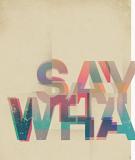
The overlaying of different colours is a contemporary take on the two-colour limit. Photography could also be changed in photoshop to just two colours, giving a lot more freedom to the design than previously thought! I really like the way that the typography in this piece is a negative of the colour as well, because it almost acts as  a third colour.
Although this image uses around 4 colours, this same effect could be portrayed through just two. I really love the vibrancy of these, but not entirely sure how I could incorporate this style into my work.
Two contrasting words could be overlapped, reflecting on the two constrasting views on political correctness and what is deemed as appropriate/ innappropriate. Perhaps 'correct/ incorrect'?, 'safe/ offensive'?

Again, the two contrasting opinions could be portrayed in two different people/ characters. This simple imagery could be an interesting concept to communicate my message.
(minus the bicycle) the use of type as the main graphic can fill the element lost when the image is taken away. I really like this layout and how all of the typography fits together consistently.
There are only 3 colours used in this image, and their half tones. Using half tones can give the illusion of there being more colours than there are, and because they are permitted in our designs, this could be a useful way of executing the designs. I also like the way that the drop shadows on the text fill in the missing image element, while still being type.


I really love the way that the typography is the main feature of this design. The typeface is very feminine and curly, and so nearly fills the page. This could be very good inspiration for my Snow White/ Jack and the Beanstalk ideas.

Investigating into layouts with type and image:

I love the way that the image does not interfere with the actual typographic design because they are only small, it only emphasizes the typography. The different fonts used help to accentuate the meaning of every word, but the design still doesn't look too busy because of the blank space and respectable border.

How can censorship be subtle? Looking at different ways of hiding/ censoring content:

Although this is to give the impression of sound waves, I really like this vertical blind effect, only revealing some of the image behind. I could apply this to my design, with the image behind being something considered politically incorrect, but not actually offensive. Maybe an image of a housewife washing up, considered sexist?
This is a really unusual way of censoring type, and gives the type character. The curl of the ampersand around the side of the screen shows it is embarrassed, or ashamed. I could use this with a statement about free speech, and use it to show how people are now becoming embarrassed/ ashamed of their own opinion, for fear it will be politically incorrect, therefore offensive.

Typographic use of the asterisk:

This was the main inspiration for the use of the asterisk in my typographic design ideas. The pretty, ornate typography is ruined with an interruption of terms and conditions. This could reflect how censorship and the use of political correctness is an implication on modern society/ an interruption of free speech.

How can symbolism tell a story/ message?:

These are really clever designs in that they communicate a message with type as the image. Although I'm not entirely sure what I could do that would connect to my message.


This Christmas design relies just as much on the typography as the colours and images used. I really like this typeface because it is immediately festive and decorative. It is innocent in it's message- this could be censored to show the hypersensitivity surrounding political correctness.

Looking into ornate styles for my Storybook style for Snow White/ Jack and the Beanstalk ideas:
The intertwining, sketchy style is typical of traditional typography. Perhaps the incorporation of banners and serif typefaces could enhance my own designs.


These novel covers by Jessica Hische are beautiful and innocent in design. The perfect layouts and simple vector images are good inspiration for my storybook style designs. If graffiti were to be applied to this, it would ruin it, in the same way that arguably political correctness can implicate free speech.


Research into Book Of Hours/ Biblical styles for bible quote:


These visuals for the book of hours can have the same effect as the storybook cover designs. They could be graffiti'd on with a statement about political correctness. If I am to portray this style, the inclusion of floral themes, blackletter text and an oversized drop cap is essential

Research into 50s photography with potentially sexist themes:

This image would be perfect because it only uses 1 colour and half tones, and is clear about the subject matter: a housewife enjoys cooking food in this image.
This advert implies that womens desires only revolve around household chores, in a potentially sexist manner. Something like this could be used to show the viewer that things that are offensive today are nothing compared to those of the past.


Banksy: the lifestyle you ordered is out of stock (inspiration for my idea: Sorry! The freedom you ordered is currently out of stock)


Nudity in Disney Characters:

This image clearly shows the fact that donald is nude from the waist down and so would be a good image to use for this idea.


Again, these past two images of Minnie clearly show her underwear and could be effectively used in my campaign, perhaps with a censor bar?

Old Bear Stories: traditional innocent child-aimed illustration:

Old traditional illustration of children's books is sweet and innocent. Could this same, sketchy style be applied to a gollywog toy? Would it have the same heart-warming feeling to the reader?


Friday, 26 October 2012

OUGD401 - Context of Practice - Session 1 - Critical Analysis

In todays context of practice session, we each gathered together our 4 examples of design we did and didn't like in groups and placed them in the middle of the table. We wrote on the back of each one whether we did or didn't like it and in groups, switched tables. 
We then had to sort out the other groups pile of examples into a like and dislike pile. 

We discovered that, quickly and subconsciously, we all used the same list for judging/ sorting work. Something along the lines of this:


  • Quality/ skills/ execution of design
  • Layout (concerning type)
  • Composition (overall)
  • Colours used
  • How effectively the design communicates
  • If the context is clear/ unclear
  • Concept
  • Legibility
  • Function
  • Suitability for audience
  • Content (non visual)
  • Content (visual)
  • Media and method of production
This list is essentially our usual criteria for analysing/ sorting work.

Critic, criticism, critical, criterion and critique come from the greek ; to judge, distinguish and/or select.

Is there a problem with us all using the same criteria? Does that mean that we cannot give constructive criticism on each others work, since we are all using the same judging techniques?
When the sorted piles of likes and dislikes were turned over we discovered that although we all have different taste, some of the groups sorting opinions were correct, and so exactly the same!

D.I.E.T. - an alternative criteria

D - describe (what can you see?)
I - interpret (what is it about?)
E - evaluate (how good is it?)
T - theorise (how could it be improved?)

We then got into partners and chose a piece of work to analyse each. We started by writing the description and our interpretation of our chosen piece. 

Here is what i wrote for my image, 'Rolling Along'

D - A logo including a cartoon/ microsoft clipart of a man on a unicycle incorporated into wordart text. There is an unusual, unrealistic drop shadow on the text only. A bright, fluorescent blue and green colour scheme. Arial font, blurry, pixelated aesthetics and old fashioned imagery.

I - I do not know what the company is/does from this logo- it is not entirely clear but the unicycle and the dashed lines behind it, accompanied with the wavy text suggest movement. The name of the company also suggests this. But this company could be anything from bike rental, to careers advice (rolling along.... progress....).

And what i wrote for Ellen's image, straightsmiles

D- blue and white colour scheme, stretched/ distorted text all in Comic Sans font in lip shape with gradient. not sure if logo or business card design.

I - From the text alone i know that it is representing an orthodontics centre, but if i could not read the text i would be able to know this because of the cold colour scheme (ie, mint toothpaste etc) and the lip shape in the background. Also, the way that the text is curved along the bottom of the lip is suggestive of a jawline.

We then swapped images and wrote the description and interpretation of that one too. We ensured that one could not see what the other was writing, so that we could compare what we had written - was a vaguer criteria the answer to independent answers?

There were more similarities than differences in our answers! 

We both identified the colour scheme in our description of Rolling Along and commented on the distortion/ manipulation of the text. We described the quality of the images more than the images themselves.
And for Straight Smiles, we could identify the company's purpose from their logo through the colour scheme and text. We both also had to comment on the font used!

We then, as a pair wrote the evaluation and the theory for the two images:

Rolling Along

E - Rolling along poorly communicates its message. The image is outdated in style and of  bad quality, ie blurriness and execution. The colour scheme is too bright, and also gives it an overall outdated feel. Old fashioned techniques have been used to create this and it is shown!

T - Redesign the whole logo! a different platform should be used to create the logo for starters such as Adobe Illustrator or Photoshop , not Microsoft clipart! A plainer, more contemporary typeface, even something like helvetica would be more effective. A different way incorporating the image should be used. A short company description should also be included, so that it is clearer what the company is all about.

Straight Smiles

E - Poor execution, again, using inappropriate programs and platforms. The distortion of the text is inconsistent and looks imbalanced because of this. Lip image in background is not quite symmetrical when it appears that it should be. Font doesn't relate to subject matter, and isn't professional. Although, the colour scheme is fresh and fits well.

T - Different typeface is needed - again, something contemporary and clinical. The lip image is a nice idea, but needs to be redrawn symmetrically and perhaps opacity to be reduced so its not too overfacing. The lip image should also be centred in the page, and the text at the bottom should be made smaller and across one line. 


What categories do our original criteria fall under in D.I.E.T. ? 

D - Colour, type selection, manipulation of type, layout, quality of image, line & stroke, texture, composition, theme, content, concept, structure. OBJECTIVE

I - message, clarity, function, context, audience, tone of voice. SUBJECTIVE

E - general aesthetics, how effectively it communicates, quality of design, quality of execution, fulfilment of purpose, clarity. SUBJECTIVE

T - dependant on image/ design. SUBJECTIVE

In summary, we found that the outcome of assessment is not only down to personal opinion, but whether what we are assessing is objective or subjective. We all have similar ideas of what is good or bad design perhaps because we all aspire to the same profession, but there are times where we disagree because of personal taste. 


"The critique is both a deadline and a marker of a perpetual beginning, a freeze frame moment in the context of a continuous studio practice. 
This favours process over product, the means over the end..."


STUDIO SESSION 1 - CRITICAL ANALYSIS

(to be continued)

OUGD401 - Context of Practice - Task 1 - Critical Analysis

Why is critical analysis an important part of education?


  1. Although we, as a class are all of different taste, we can all appreciate good and distinguish bad design. And so when we have a group critique you can trust that you are getting a good outside opinion of your work, where they can see weakness that perhaps you yourself cannot.
  2. Group critiques are especially useful because you can receive/ give collective descriptions and pure interpretations of your work en masse, and so receive feedback as to whether the message you are trying to deliver is apparent or not.
  3. It's important because you can make mistakes and learn from your student colleagues in a safe environment where the deadline is the only reason to panic, not money or clients.
  4. You can be introduced to new/ more suitable design styles that are suggested during group critiques.
  5. You can measure your own abilities next to your contemporaries. This can either have a positive effect on your self esteem or inspire/ aspire to change your work for the better.

Five criteria that effect the way I judge if I like/ dislike a piece of work:

  1. Quality - If the quality is pixelated, fuzzy or if an illustration is not particularly well executed I am not usually interested in the rest of the design.
  2. Colours - I am particularly drawn to creative use of colour, and the scheme doesn't have to be minimal. The more colour the better, as long as it is used tastefully.
  3. Function - Packaging that has boring graphics but is especially inventive/ unusual/ creative in it's net will spark my interest a lot more than normal packaging with great graphics on. 
  4. Composition - If the composition/ layout is cluttered or overcrowded I do not favour it, unless there is a clever composition of hierarchy to clarify it.
  5. Media and Method of Production - I particularly favour Graphic design that has been letter-pressed / wood-blocked / laser cut/ multi media because of my current intrigue in these methods.

Thursday, 25 October 2012

OUGD403 - Message and Delivery - Research

Brief

Create a body of visual research in responses to a story, issue or theme found in the national press tomorrow, Tuesday 23rd October.

Background/ Considerations

The willingness and ability to formulate informed opinions about your subject matter is an essential skill for a graphic designer. 

In addition to being aware of events, concerns and the (un)popularly held opinions of the world around you, you also need to consider the tone of voice with which they are reported. It is important that you read the stories thoroughly and research issues that are raised fully committing yourself to a visual opinion.

You can be serious, humorous, questioning, bold or subtle.

Mandatory Requirements

The story, issue or theme must come from a newspaper published on Tuesday 23rd October.

Deliverables

A body of research into the story, issue or theme of your choice. 
A physical copy of the newspaper.

Studio Deadline: Friday 26th October

Module Deadline: 23rd November 2012


My Chosen article:


This article, found in 'i' is an informal report on an incident concerning a man commenting on his views about gay marriage via Facebook and having a 40% pay cut because of it.

The tone of voice in this article, although informative is quite chatty and tells the story from the viewpoint of the author. He thinks that punishment for what he considers to be free speech is not a 'reasonable use of police or legislative time' and that 'modest opinions alone are no warrant for a demotion'.

The daily mails' article on this is much more neutral in opinion but there is still an underlying voice against censorship and punishment on freedom of speech.

Using this idea of restricted opinions, i found this image on censorship:


Aside from its caption, I really like this image, as it portrays an idea that sometimes the fact that the subject has been censored/ punished for is more offensive than the actual material itself.

I found in this extract from the public and commercial services union website, that you can claim compensation of up to £50,000 for 'injury to feelings'. Could this be the reason people are so 'sensitive'? 

Posters used to shun the use of free speech. They are almost warning in tone of voice and are stern in their message. I do not agree with this kind of attitude and want to use a less serious, more jovial tone in my own work, but want to still have a serious message.


This cartoon is depicting what can happen if you say too much. But, in my work I want to question what is 'too much'? I really like the execution of this as it needs no text to justify it's meaning in a lighthearted way.

I really like this design. I'm not sure of it's intended meaning but it could be used to show how freedom (of speech in this case) is limited. The dancer is not free to dance. Again, I think the most effective way of communicating my message would be without text.


Simple typography with an unrevealing title could intrigue the reader into looking/ reading further?
The use of the asterisk is a really simple tool- a symbol of political correctness?


I really love the symbolism in this piece, I think that using simple aesthetics would be the most effective way to communicate my message, with the support of a paragraph to inlcude details / actions for the reader to take. Perhaps a petition?
  • There is even a whole page on the guardian online about censorship and the constant, daily battles of offending others which could be challenged?
 
  • This article, found on Wikipedia, describes how the use of the term 'Christmas' is usually avoided in marketing in the United States for fear it will offend, even when referring to Christmas related items such as Christmas trees and Christmas holidays. Here is an extract from the article about seperate incidents regarding 'Christmas controversy'. 'A controversy regarding these issues arose in 2002, when the New York City public school system banned the display of Nativity scenes, but allowed the display of supposedly less overtly religious symbols such as Christmas trees, Hanukkah menorahs, and the Muslim star and crescent.[17] The school system successfully defended its policy in Skoros v. City of New York (2006).[18]In December 2007, a controversy arose[3] when a public school in Ottawa, Canada planned to have the children in its primary choir sing a version of the song "Silver Bells" with the word "Christmas" replaced by "festive"; the concert also included the songs Candles of Christmas and It's Christmas with the original lyrics. Also, in 2011, in Embrun, Ontario, near Ottawa, one school has barred the Christmas pageant and replaced it with a craft sale and winter concert scheduled for February, 2012. (Ottawa Citizen, December 2, 2011).'
  • Another article, found on the BBC News website, tells of how a nursery was accused of being over politically correct by changing 'baa baa black sheep' to 'baa baa rainbow sheep' because the original was 'racist'. This was in fact untrue and the nursery changed it for other reasons, where all the colours of the rainbow were mentioned so that the children could learn about colours. Could this be because that political correctness is now expected of the public? Does offence come from ourselves/ are we looking to be offended?
  • This article, found on the guardian online, shows one mans opinion on how Golliwog dolls are 'a vile throwback to a racist past'. While browsing through the comments section, about 10% agree with his statement, while the remaining 90% accuse him of being over sensitive over what they perceive to be nothing more than a Victorian doll. This hypersensitivity could be represented in bold imagery that makes the reader question why they are offended perhaps?
 Politically Incorrect cartoons: 

Steamboat Willie


There are lots of things that this original classic could be criticized for in politically correct terms. For example, the scene where Minnie doesn't get on the boat in time, and so Mickey lifts her up with a crane by her underwear to lift her aboard. Or when Mickey plays tunes on all of the animals on board, such as pulling the tails of the piglets/ strangling the goose... 
But this is an old, trusted favourite. Why should this be banned/ censored? Although it is politically incorrect, in my opinion it is harmless.

Donald Duck: In der Fuhrers Face


However, there are lots of offensive materials that Disney has produced, such as this cartoon about Donald Duck. He has a nightmare that he is a Nazi under the order of Hitler and wakes up and is thankful that he is American and against the Nazis. This kind of propaganda is really risky in terms of keeping Disney neutral and clean of opinions. And yet, harmless cartoons/ imagery is seen as offensive, and this is left un-criticized?

Stereotyping:

This passage explains some of the types of stereotyping which others may find offensive. This could be turned into images- and indicate to the reader what they are about. The reader may be offended by this, but without text or abusive language or generalization, is it really offensive?

'Common Stereotypes

African Americans

One of the more common stereotype examples is stereotypes surrounding African Americans. Saying that all African Americans are good at sports is a stereotype, because it’s grouping the race together to indicate that everyone of that race is a good athlete. Another stereotype would be that all African Americans love to eat KFC, drink purple grape juice and eat watermelon.

Men and Women

There are also some common stereotypes of men and women, such as:
  • Men are strong and do all the work.
  • Men are the “backbone.”
  • Women aren't as smart as a man.
  • Women can’t do as good of a job as a man.
  • Girls are not good at sports.
  • Guys are messy and unclean.
  • Men who spend too much time on the computer or read are geeks.

Cultures

Stereotypes also exist about cultures an countries as a whole. Stereotype examples of this sort include the premises that:
  • All white Americans are obese, lazy, and dim-witted. Homer Simpson of the TV series The Simpsons is the personification of this stereotype. 
  • Mexican stereotypes suggest that all Mexicans are lazy and came into America illegally.
  • All Arabs and Muslims are terrorists.
  • All people who live in England have bad teeth.
  • Italian or French people are the best lovers.
  • All African Americans outside of the United States are poor.
  • All Jews are greedy.
  • All Asians are good at math. All Asians like to eat rice and drive slow.
  • All Irish people are drunks and eat potatoes.
  • All Americans are generally considered to be friendly, generous, and tolerant, but also arrogant, impatient, and domineering.

Groups of Individuals

A different type of stereotype also involves grouping of individuals. Skaters, Goths, Gangsters, and Preps are a few examples. Most of this stereotyping is taking place in schools. For example:
  • Goths wear black clothes, black makeup, are depressed and hated by society.
  • Punks wear mohawks, spikes, chains, are a menace to society and are always getting in trouble.
  • All politicians are philanders and think only of personal gain and benefit.
  • Girls are only concerned about physical appearance.
  • All blonds are unintelligent.
  • All librarians are women who are old, wear glasses, tie a high bun, and have a perpetual frown on their face.
  • All teenagers are rebels.
  • All children don't enjoy healthy food.
  • Only anorexic women can become models.'
 JUST TO CLARIFY I DO NOT AGREE WITH STEREOTYPING, AND DO FIND IT OFFENSIVE. But does this not mean that being offended is self-induced?