For Our How-to Brief, we had to 'get someone to try something new' We decided to try to get lazy students to get fit and active.
For the research, we started to look into health and fitness graphics. I started looking at different reference photographs for my illustrations.
Ideas for colour schemes/ style:
 |
| We liked this colour scheme but it possibly looks too professional? |
 |
| Though iconic, in my opinion this logo is somewhat dated because of it's bold lettering and neon colours. We want something not quite so stark but that still says 'exercise'. |
 |
| These illustrations are clean and easy to read, which is the key. We will not be doing hand drawn illustrations for our final product. |
We decided upon these exercises because they were relatively easy (we tried them out as a group!), and that they required no equipment or copious amounts of time to execute, which would appeal to our audience.
I chose to use these images instead of the others I had found because they were the most clear because they were taken from a definite, understandable angle. They also had, when required, clear images of the other positions in the exercise. I decided to illustrate all of the positions and have them all in the same image, but with the moving positions just as outlines, so that they all looked like a single image, and so matched the last image, which had no other positions.
Research into apps:
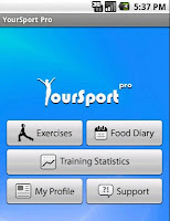
The front page of the app on the left is really nice because it's not totally clinical, and the illustrations encourage exercise outside of the gym, which would appeal more to our target audience.
The app on the right is very informative and easy to understand.
We hope to combine both of these elements into our app.
I really like the menu on the left because it not only includes a written description of the exercise, but a little pictoral icon to go with it. Being visual as well as written will assist the user. I think we should also include the time it will take to execute the exercise, as it may surprise the user into how little time it takes, and persuade them to doing the exercise.
We think that a good feature of the app would be a stopwatch, so the user can time themselves at each move, and test to see if they can push themselves further and further. I think that this feature should not be separate from the exercise page, because the user will have to be looking at both at the same time.
All of the features on the app on the right inspired some of the ideas we came up with for our app/
I really like the pictorial version of this stopwatch, it is a lot more interesting in design than the previous one I looked at.


No comments:
Post a Comment